

There’s a reason the wall above the bed gets so much attention—it sits right in the middle of the room’s main focal point. A single oversized piece can make the whole setup feel calm and intentional, while shelves, mirrors, woven pieces, or a gallery wall can push the bedroom in a completely different direction.
These over-the-bed wall decor ideas explore all of those possibilities, from soft botanical grids and sculptural pieces to dramatic portrait walls, warm woven textures, metallic accents, and colorful statement art. The fun part is seeing how much that one stretch of wall can change the mood of the room.
Soft Abstract Art for a Quiet Neutral Bedroom
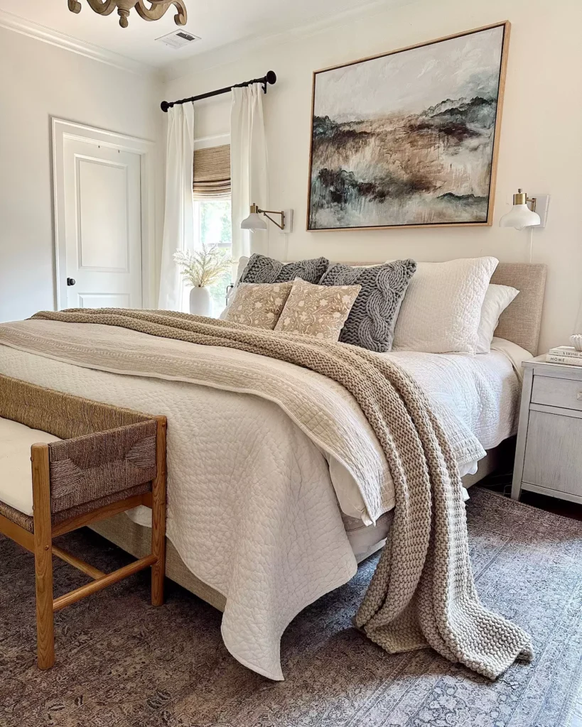
One framed abstract piece is enough to finish this wall because the bed and surrounding palette are already calm.
The pale artwork echoes the beige upholstery instead of fighting it, so the room gains a focal point without losing its softness.
This is especially effective when the frame width feels connected to the bed rather than floating too narrowly above it.
A Floating Shelf That Can Change With the Room
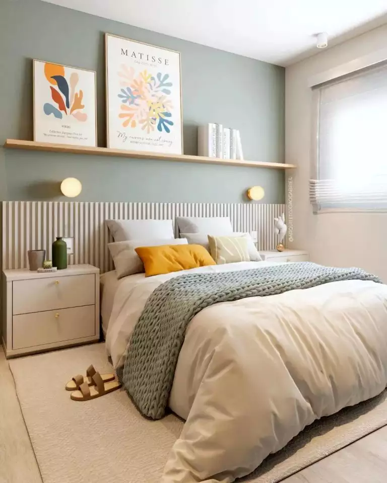
The sage wall already gives the bedroom color, so the shelf adds interest without demanding another large statement piece.
A few leaning frames and small decor pieces create layers while keeping the arrangement flexible.
That is the real advantage here: the wall can evolve without starting over every time you want a different look.
Nine Botanicals With Beautiful Grid Discipline
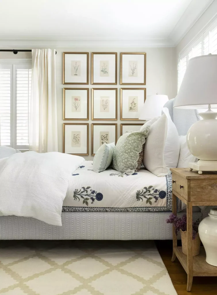
A neat grid of botanical prints gives this white bedroom just enough structure.
The repeated frame size and even spacing make the wall feel polished, while the delicate plant imagery keeps the effect light.
Because the grid is wide rather than tall, it also sits naturally above the bed instead of pulling the eye too far upward.
Soft Boho Texture With a Draped Fiber Hanging
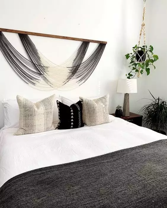
This woven wall hanging adds movement where framed art would feel much flatter.
The long strands soften the stronger geometry of the headboard, and the black-and-white bedding keeps the whole look grounded. It feels relaxed and tactile without needing extra color.
Rustic Sentiment Above a Cozy Bed
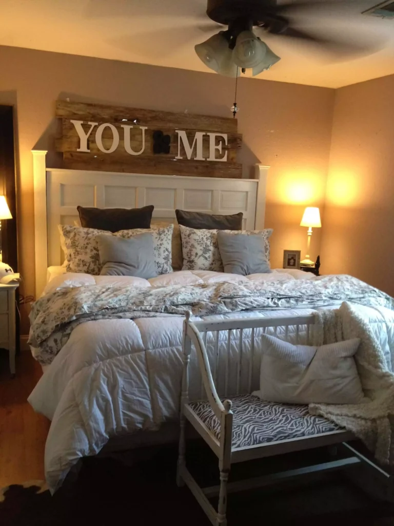
A wood “You and Me” sign makes the wall personal without turning it into a full gallery.
Its horizontal shape suits the width of the bed, while the warmer wood tone adds contrast against the darker backdrop.
The message is simple enough that it reads as part of the room rather than as a novelty sign.
White Sculptural Art That Changes With the Light
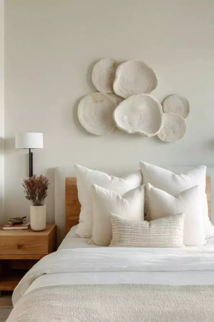
This bedroom stays neutral but still gets plenty of interest from raised ceramic-like wall forms.
The shapes create real shadow and dimension, which means the wall changes subtly as daylight moves across it.
That makes it especially effective in an otherwise restrained bedroom where texture matters more than color.
Rattan Above the Bed, With Storage Built In
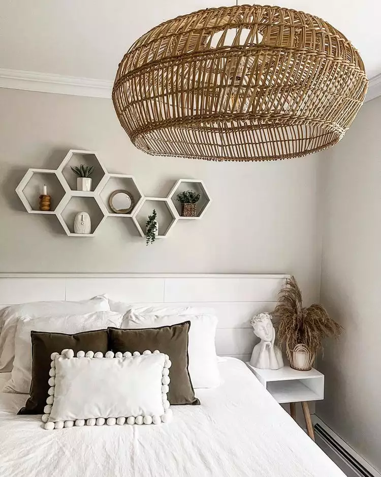
The woven pendant and honeycomb wall shelves bring function and texture into the same zone.
Instead of one centered artwork, the wall gains depth from the shelf shapes and the warm natural material overhead.
Small decor pieces can live there without overwhelming the room, as long as the shelves stay lightly styled.
A Dark Botanical Print With Old-World Character
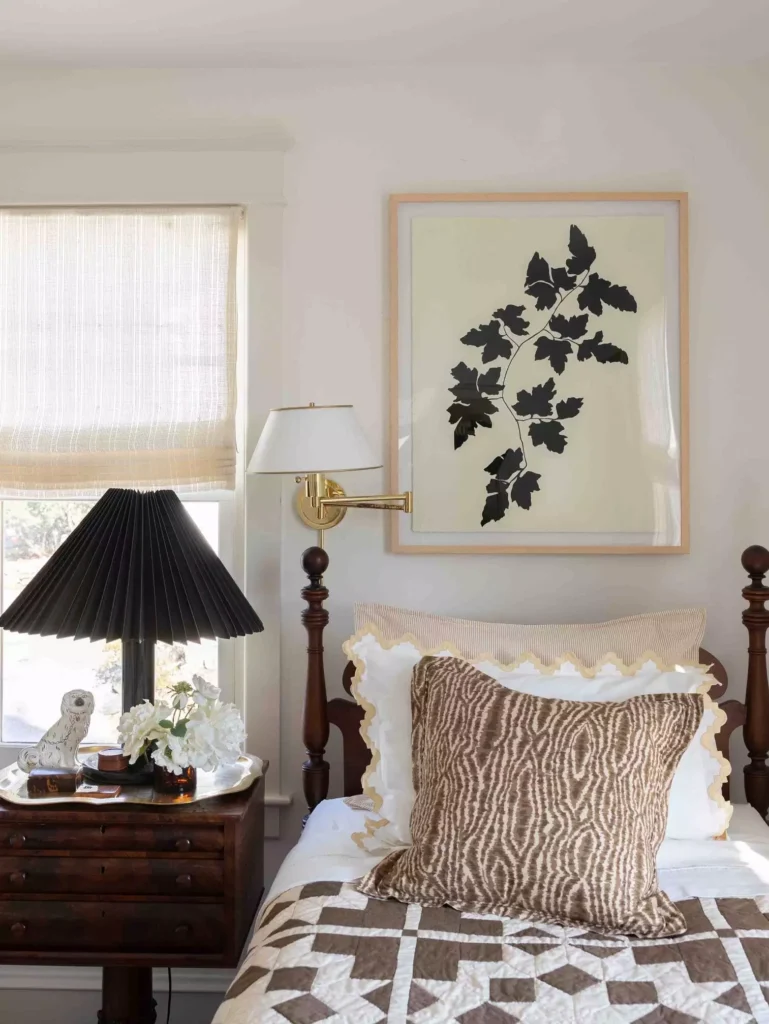
A black botanical print gives this warm wood bed a more dramatic backdrop.
The darker artwork creates contrast without introducing bright color, and the vintage-inspired subject suits the traditional feel of the furniture.
One strong piece works well here because the room already has enough visual warmth elsewhere.
Monochrome Art With a Warm Sconce Glow
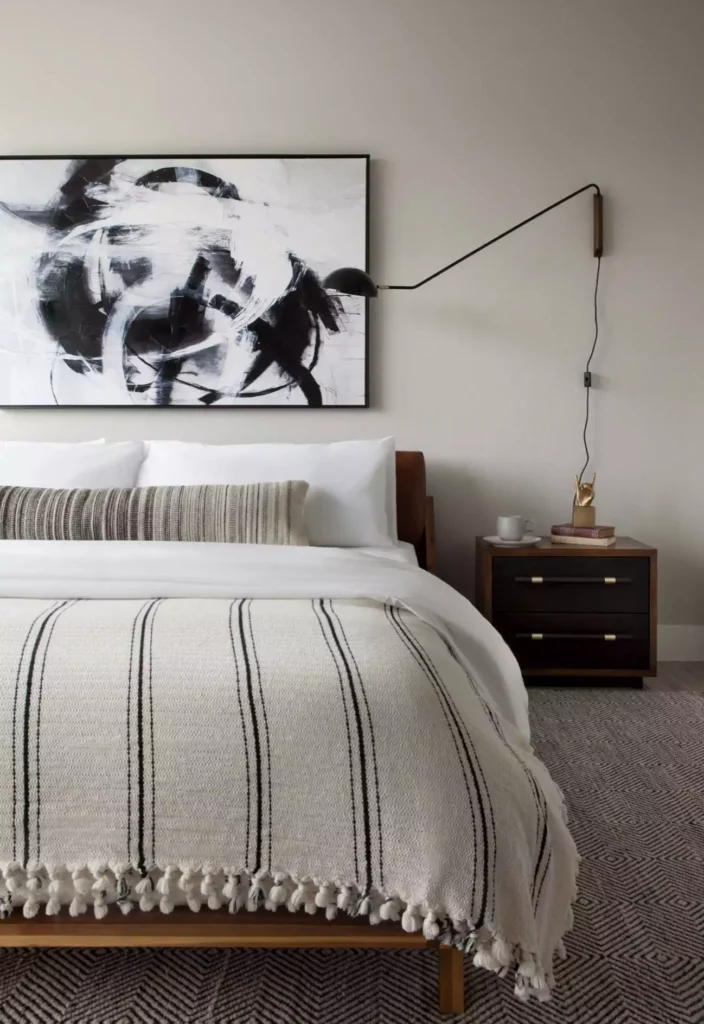
Black-and-white artwork keeps the palette clean, while the wall sconce adds a softer evening layer.
The light changes the way the art reads after dark and makes the whole arrangement feel more intentional than a frame alone.
It also gives the wall a practical role rather than treating it as decoration only.
A Boho Shelf Filled With Plants and Art
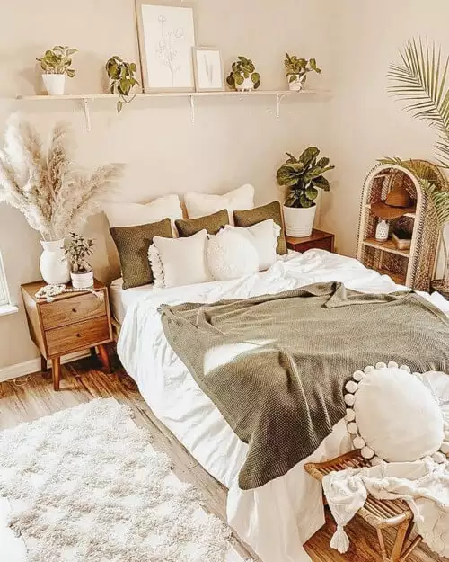
This arrangement feels relaxed because the pieces are layered rather than lined up too perfectly.
Frames, greenery, and smaller objects share one long shelf, creating depth above the bed without covering the wall from top to bottom.
The plants soften all the straight edges and keep the display from feeling too rigid.
One Raffia Sunburst With Plenty of Breathing Room
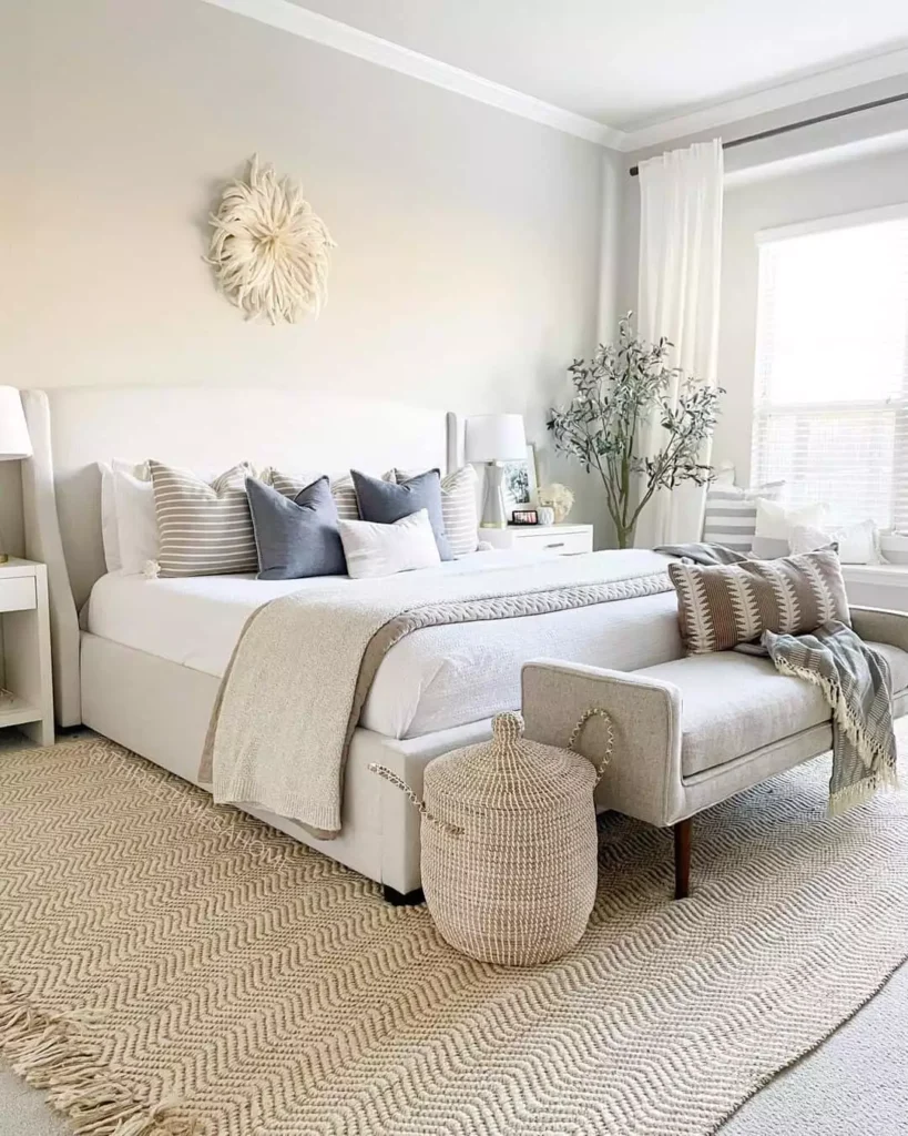
A woven sunburst medallion is enough on its own in this light neutral room.
Its circular shape breaks up the rectangle of the bed, while the natural texture adds warmth without changing the color palette much. Leaving open wall around it is what gives the piece presence.
Two Abstract Prints With Minimalist Balance
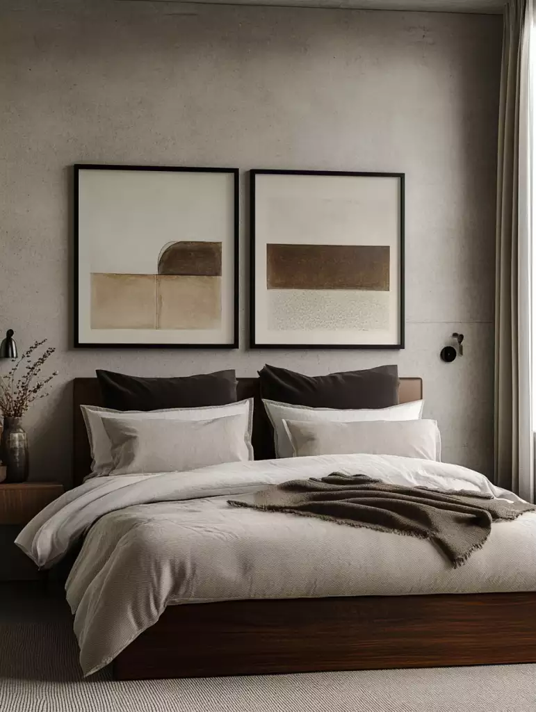
A matching pair of framed abstracts gives this wall symmetry without making it overly formal.
The equal spacing creates a calm rhythm above the bed, while the muted artwork keeps the room visually quiet.
Two pieces can be a sweet spot when one feels too sparse and a full gallery feels like too much.
A Layered Flower Against a Dark Wall
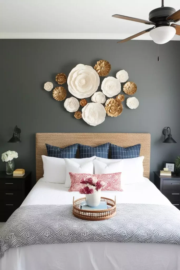
This sculptural flower stands out immediately because of the contrast behind it.
The pale petals catch light and create shadow against the charcoal wall, turning one object into a strong focal point. The wall does not need anything else because the texture is doing the work.
Woven Baskets and Plates With Collected Character
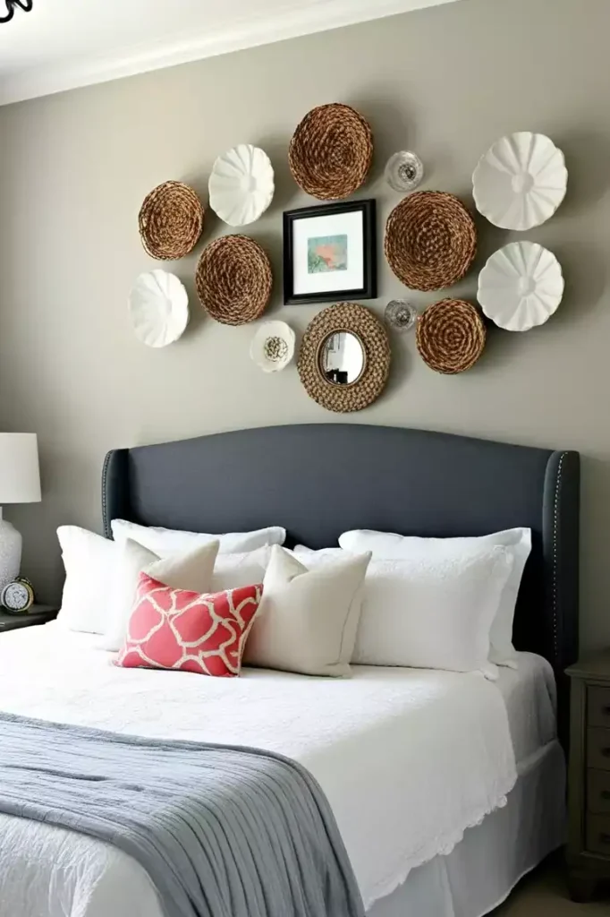
Different woven pieces, a small mirror, and framed art come together in a loose arrangement above the navy headboard.
The mix works because the materials are related even when the shapes are not. Round baskets soften the rectangular bed, while the darker headboard keeps the pale woven pieces clearly defined.
It feels collected rather than perfectly coordinated.
Carved Leaves for a More Sculptural Boho Look
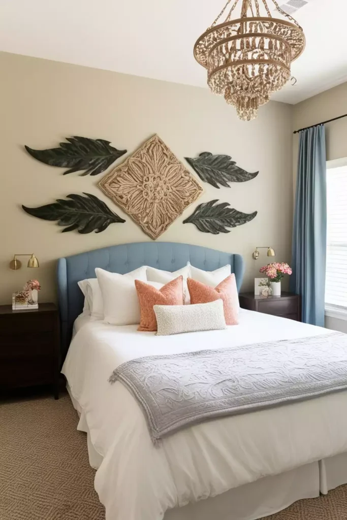
Carved leaf shapes and a central medallion add depth without the softness of fabric or macrame.
Their earthy tones work especially well against the blue headboard, giving the wall contrast while keeping the palette grounded. The arrangement feels decorative but still light enough for a bedroom.
Earth-Tone Abstracts With a Modern Gallery Feel
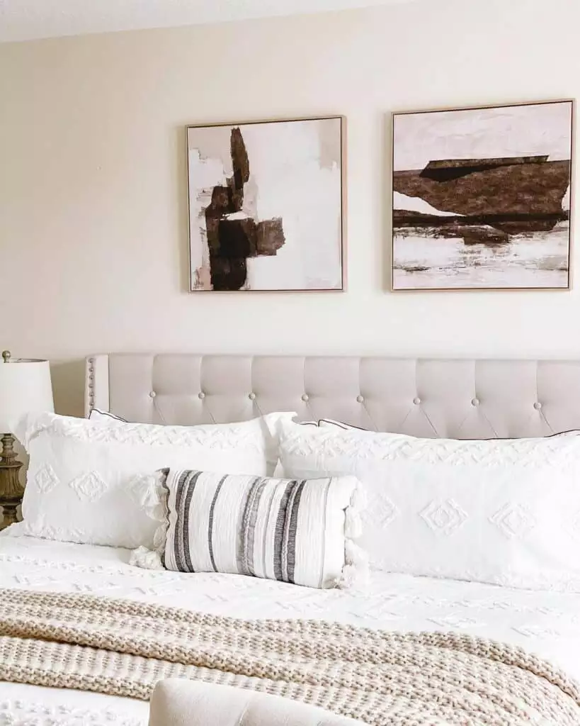
Two warm abstract paintings give the room color without introducing anything too sharp.
The pieces relate through their earthy palette, but they are not identical, which keeps the wall from looking overly matched. That slight difference gives the arrangement a more collected, gallery-like quality.
Art, Mirrors, and One Long Gallery Shelf
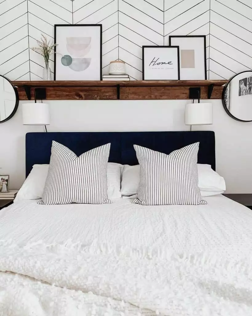
A deep navy tufted headboard creates a strong base for a layered shelf above it.
Framed art and mirrors overlap slightly, bringing reflection and depth without needing to mount every piece separately. The shelf keeps the whole arrangement visually connected to the width of the bed.
Holiday Charm With a Vintage Reindeer Sign
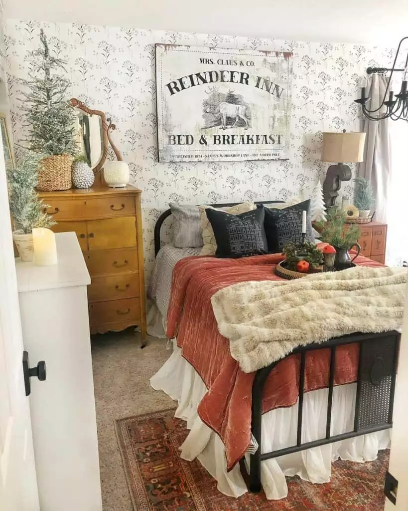
This bedroom leans into seasonal decorating with a rustic Reindeer Inn sign above the bed.
The aged-looking wood fits naturally with the warmer bedding and cabin-like details, so the holiday piece does not feel pasted on.
Because it is seasonal, the wall can easily return to something simpler after winter.
One Sweet Dreams Sign and Nothing More
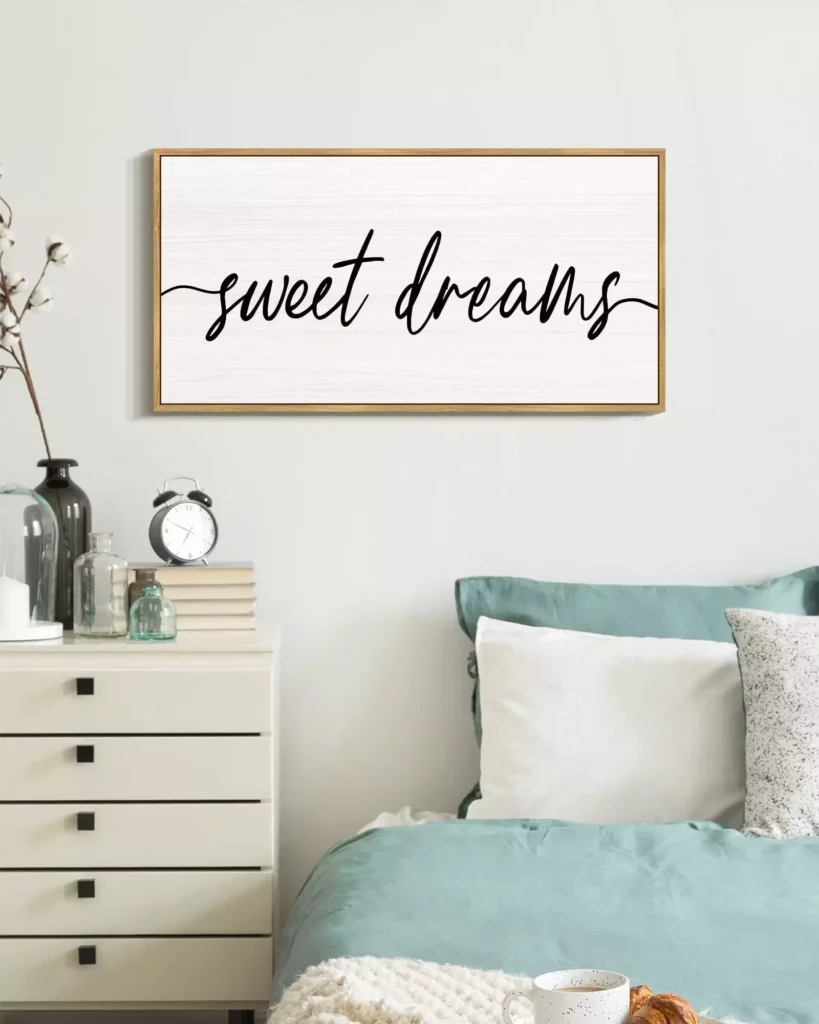
A single framed script piece keeps the wall clean above the teal bed.
The light background stands out clearly against the stronger bed color, while the simple wording adds a little charm without turning the room into a themed space.
Sometimes the best choice is simply knowing when to stop.
Three Frames Turning One Message Into a Composition
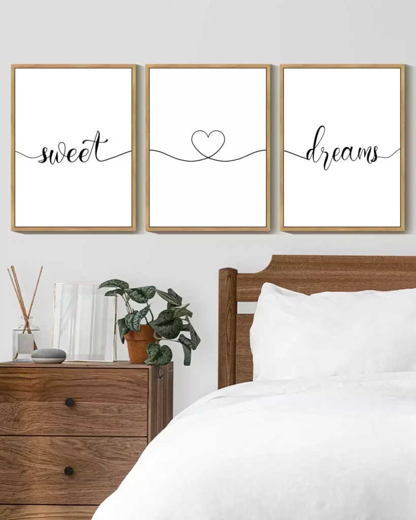
Here, “sweet dreams” is split across three frames with a small heart in the center.
The spacing gives the phrase more width, which helps it sit comfortably above the bed.
The central heart also breaks the text into a softer visual rhythm rather than making the wall feel like one long sign.
Small Gold Sunbursts With a Little Sparkle
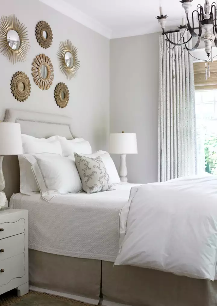
A cluster of gold sunburst mirrors creates movement without relying on traditional artwork.
Different sizes stop the arrangement from feeling too uniform, while the metallic finish catches light around the bed. The result is glam, but still playful rather than formal.
A Pale Botanical Grid in an Almost-All-White Room
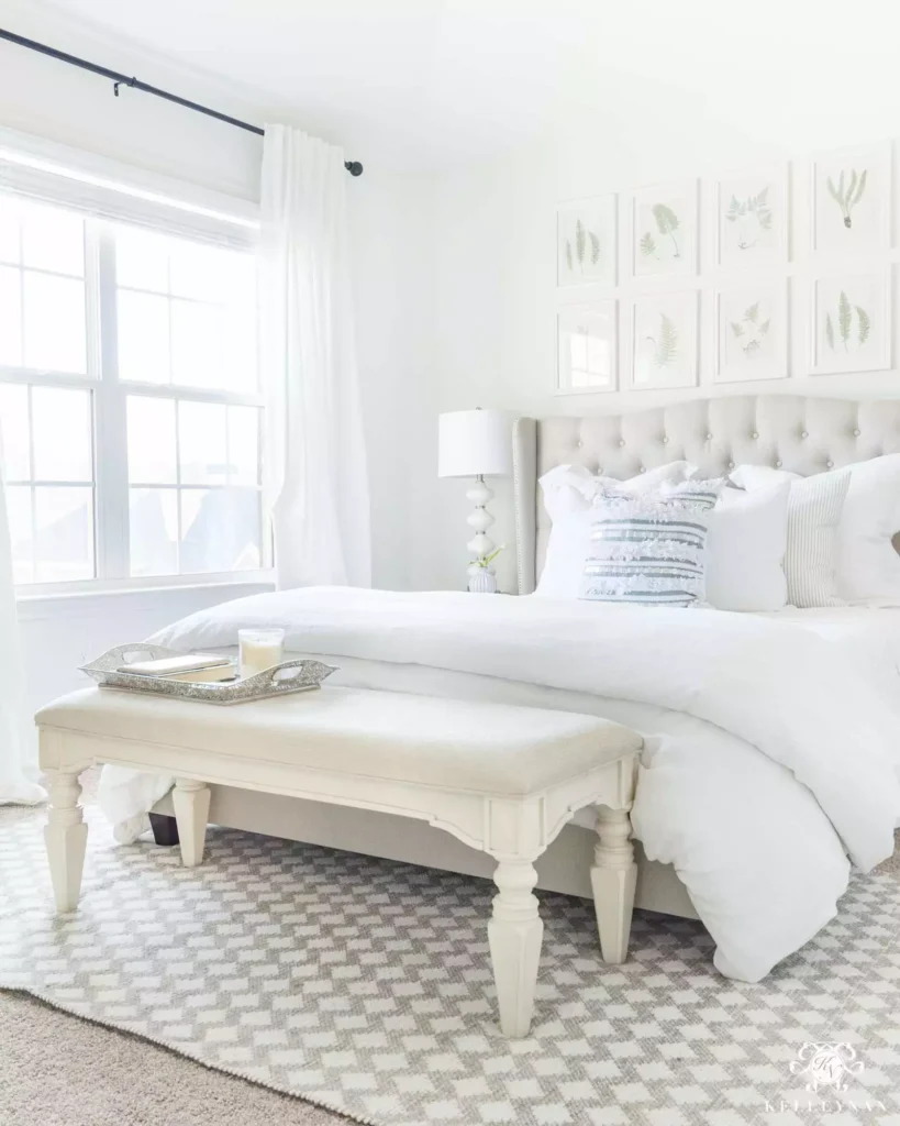
Soft botanical prints barely interrupt the brightness of this bedroom, and that is exactly why they work.
The repeated frames create structure, but the pale artwork stays close to the room’s existing tones. The wall looks finished without becoming the first thing you notice.
A Rustic Shelf With Art and Greenery
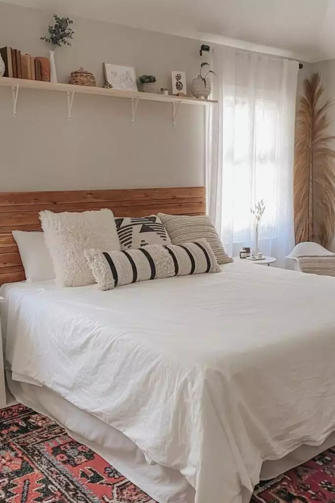
The wood shelf adds a warmer horizontal line above the bed and gives smaller objects somewhere to belong.
Layered frames and greenery make the display feel lived in, but the shelf itself keeps everything visually contained.
Against the pale wall, the natural timber becomes part of the decoration too.
Two Raffia Juju Hats With Big Texture
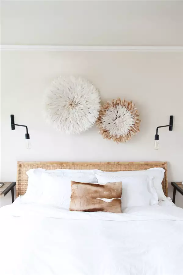
One woven piece would already have presence, but the second smaller one makes the arrangement feel more dynamic.
The layered circular shapes soften the straight headboard and bring strong texture into an otherwise simple room. Because both pieces use similar materials, the asymmetry still feels connected.
A Romantic Wood-Cut Quote With Very Little Weight
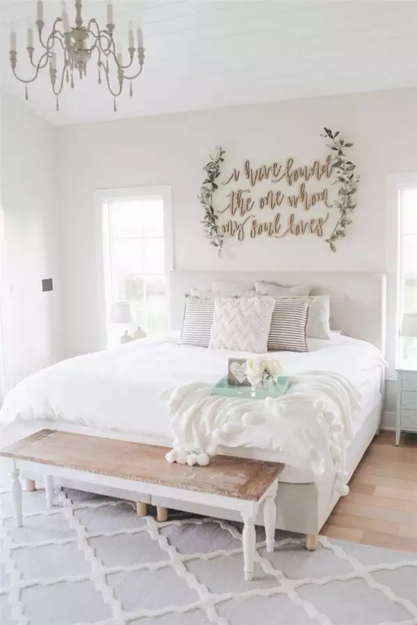
A script-style wood cutout adds personality without the visual heaviness of a framed print.
Its narrow lines allow plenty of wall color to remain visible behind it, which suits the light bedding below.
This kind of piece works best when the lettering stays simple enough to read as part of the room.
Navy and Cream Fiber Art With Graphic Contrast
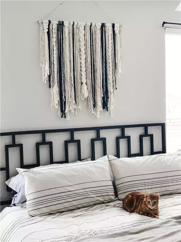
This fiber wall hanging adds softness above a much more geometric headboard.
The navy threads connect with the darker bed structure, while the cream strands keep the wall from feeling too heavy. It is a nice balance of graphic and tactile elements in one spot.
Three Floating Shelves With a Full Display Moment
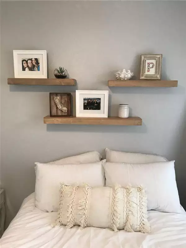
This wall goes bigger on shelving, using three separate ledges to build a whole composition.
Frames, small objects, and greenery are spread vertically rather than crowded onto one shelf.
The staggered layout gives the wall dimension, but keeping enough empty space between pieces is what prevents it from feeling like open storage.
Rattan Sunbursts With One Framed Piece in the Mix
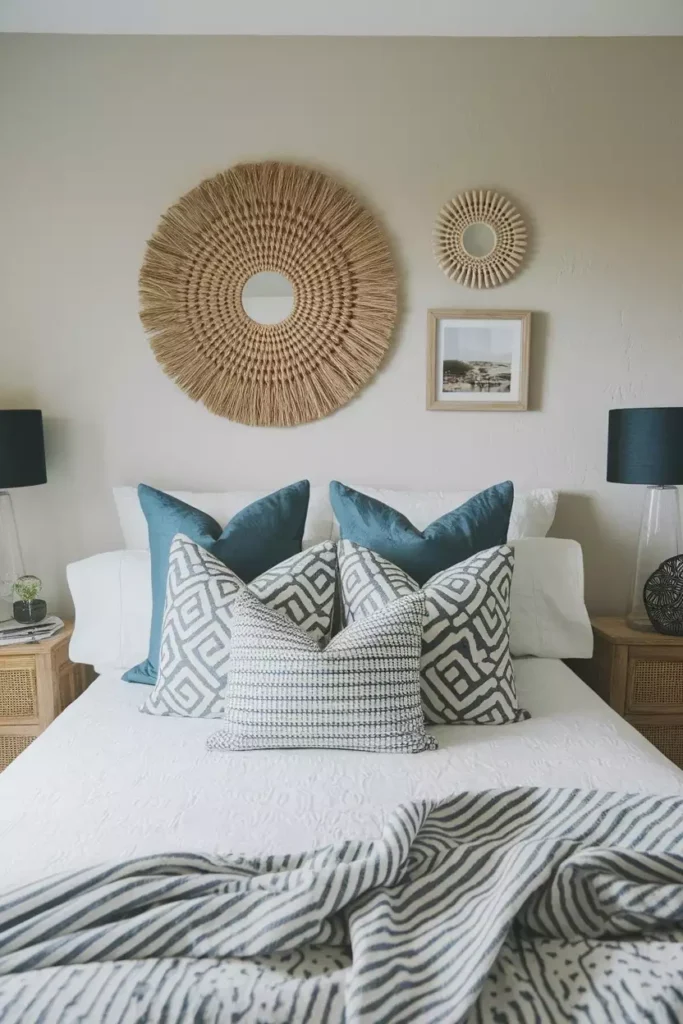
Woven mirrors and a framed print share the wall, creating more variety than either material would on its own.
The rattan adds warmth and circular movement, while the rectangular artwork gives the arrangement structure. Mixing both keeps the wall from feeling too symmetrical or too casual.
Three Woven Mirrors With Graduated Scale
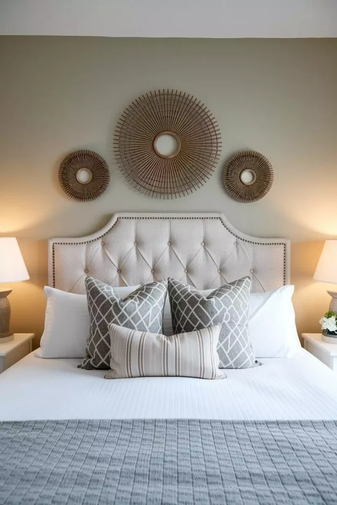
Three round mirrors step down in size across the wall, creating an easy visual rhythm.
Their woven frames bring warmth to the tufted headboard, and the repeated circular shape keeps the arrangement cohesive. The changing scale adds movement without needing lots of different materials.
Brass Lighting Framing a Metallic Centerpiece
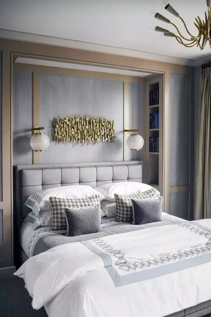
This wall feels more built-in because the lighting and wall sculpture were considered together.
Brass sconces sit on either side of the central metallic art, creating symmetry around the bed. The repeated warm finish makes all three pieces read as one coordinated composition rather than separate accessories.
A Portrait Gallery That Goes All the Way Up
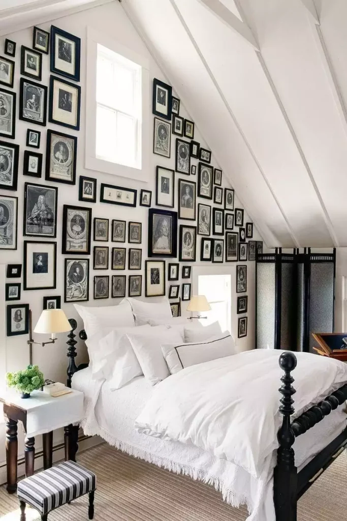
This is one of the boldest walls in the set.
Vintage-style portraits and mismatched frames climb from above the bed toward the ceiling, turning the entire wall into a feature. The dense arrangement works because the variety is part of the idea rather than something being hidden.
It is dramatic, a little eccentric, and definitely not trying to disappear.
Mint Carved Panels for Soft Scandinavian Order
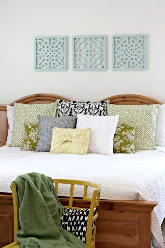
Three carved panels bring gentle pattern to the wall without filling it with artwork.
Their pale mint tone fits comfortably with the light bedroom, while the repeated shapes give the wall symmetry. The carved detail is subtle enough that the room still feels calm.
A Quote Sign Framed by Woven Basket Trays
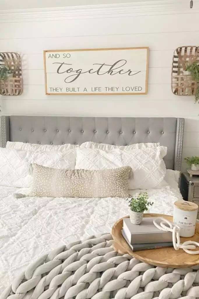
The central framed message gets more presence from the woven pieces placed on either side.
Those circular accents soften the rectangular sign and introduce natural texture, while small touches of greenery keep the composition from feeling too static.
It is simple, but the balanced layout makes it feel finished.
Botanicals Under a Tall Brass Chandelier
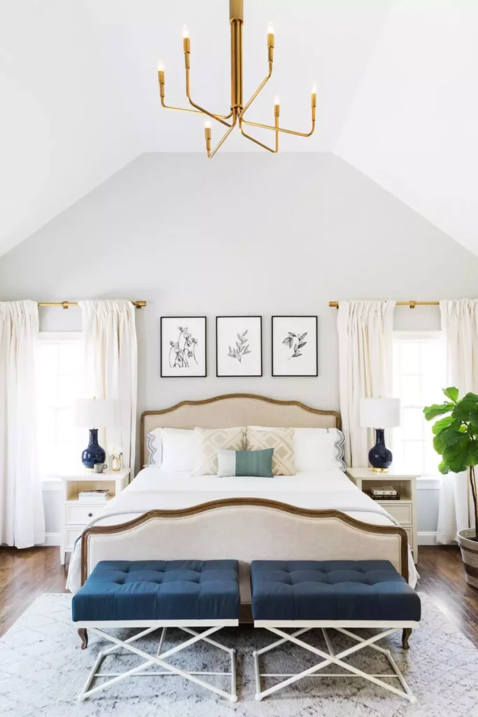
A vaulted ceiling gives this room more height than a standard bedroom, so the wall decor can afford to sit within a larger vertical composition.
Three botanical prints keep the area above the bed orderly, while the brass chandelier draws the eye farther upward.
Together, the wall art and lighting make use of the architecture instead of leaving the upper space empty.
String Lights Over a Full Gallery Wall
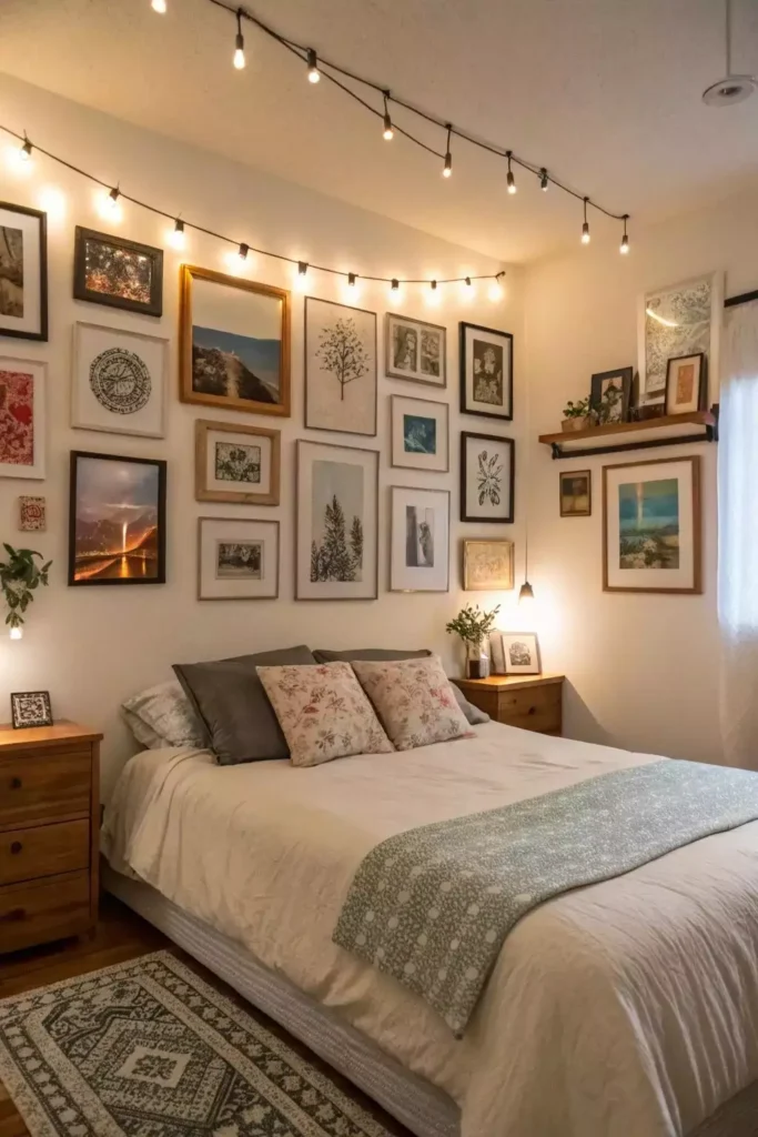
This wall is already busy with art, but the string lights change the mood rather than adding another visual theme.
The warm bulbs soften the harder frame edges and create a cozy glow after dark.
Because the gallery is intentionally eclectic, the lights feel playful instead of overly polished.
Black and Gold Frames for a More Tailored Gallery
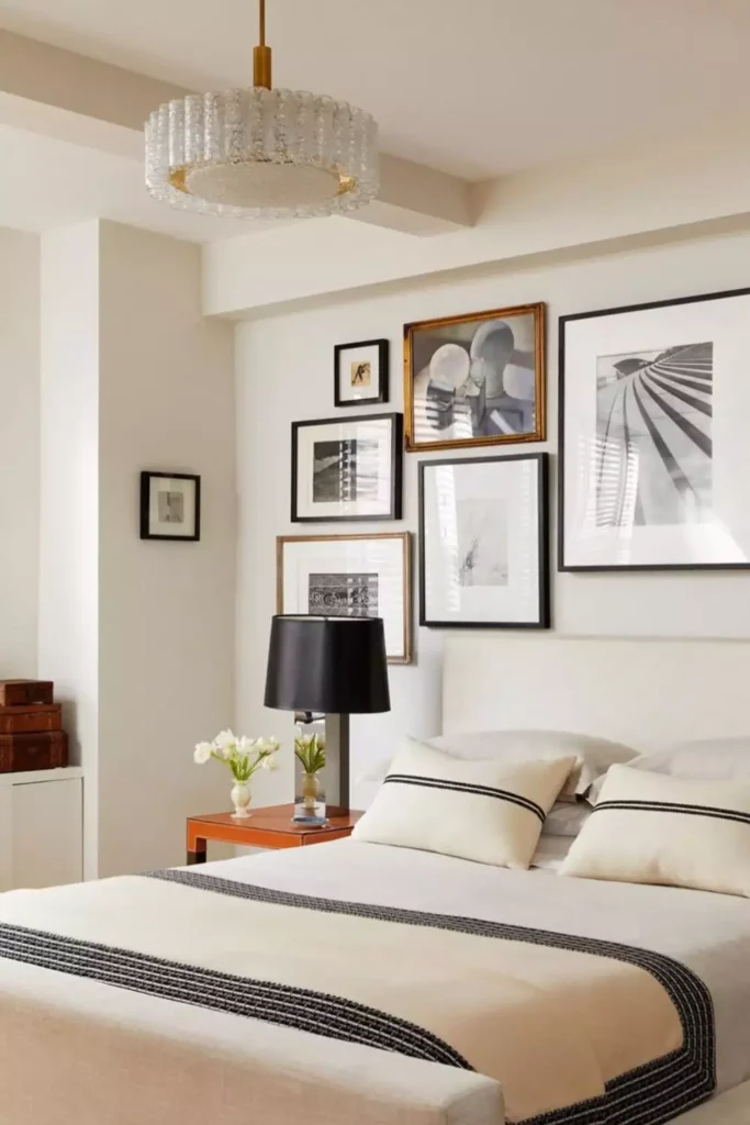
Photography and artwork mix across this wall, but the limited black-and-gold framing keeps everything connected.
The different image sizes bring variety, while the repeated metallic and dark finishes stop the display from feeling random.
It is more formal than the colorful gallery walls in the set, but still relaxed enough for a bedroom.
A Colorful Gallery Wall That Does Not Take Itself Too Seriously
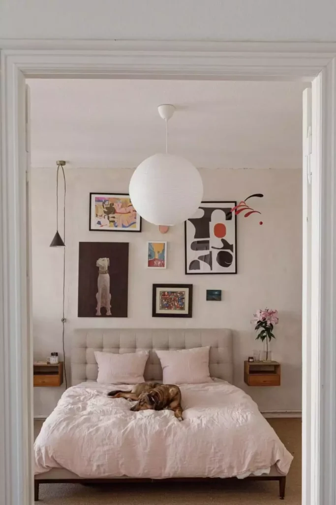
Above the gray bed, mixed art turns the entire wall into a playful focal point.
Different colors, frame sizes, and media make the collection feel personal rather than carefully matched.
The gray bedding is what keeps all that visual energy from spilling into the rest of the room.
One Large Blue-and-Pink Canvas With Serious Presence
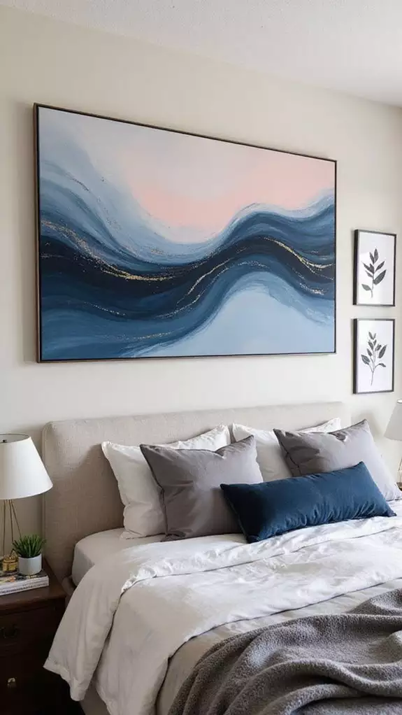
A single oversized landscape-style abstract fills most of the wall above the bed.
The blue and pink tones bring color without needing a cluster of smaller pieces, and the broad scale makes the artwork feel properly connected to the width of the bed.
When the art is this large, letting the surrounding wall stay simple makes it feel much stronger.
The Best Piece Usually Knows When to Stop
The space above a bed does not always need more decoration. Sometimes one oversized canvas, one woven medallion, or two balanced prints are enough. In other rooms, the wall can handle a fuller story through shelves, portraits, mirrors, baskets, or a gallery that keeps climbing.
The difference is proportion. A small piece can disappear over a wide headboard, while too many objects can make the bed feel boxed in. The strongest examples here give the decor enough room to breathe while still making it feel connected to what sits underneath.
Once that relationship feels right, the wall stops looking empty—and the bed finally feels like it belongs there.