

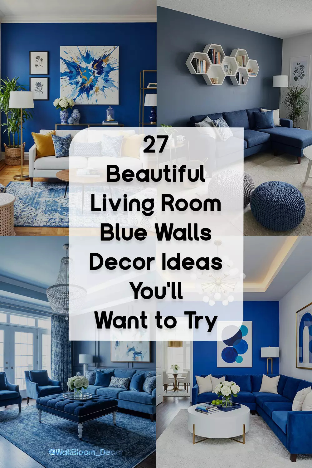
Some blue living rooms feel calm enough to nap in. Others go full drama with navy walls, velvet seating, brass mirrors, or mustard accents. What changes the mood is usually everything around the paint—the furniture, the light, the textures, and the other colors sharing the room.
These living room blue wall decor ideas show that range, from pale coastal blues and white sofas to deep teal, warm leather, patterned rugs, gallery walls, rattan, and gold details. The useful part is seeing how differently blue behaves from one room to the next.
Bold Blue With a Splash of Mustard
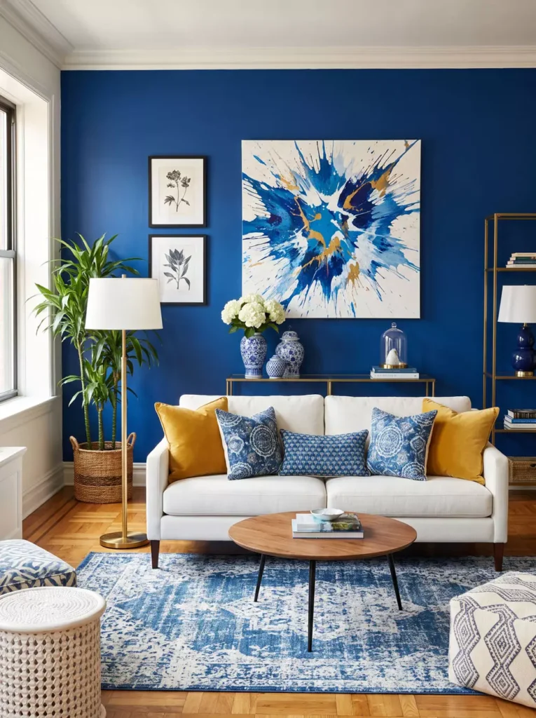
The rich blue wall gives the abstract canvas a strong backdrop, while mustard cushions add warmth around the pale sofa. Smaller framed pieces beside the main artwork stop the wall from depending on one oversized canvas.
Because the furniture stays light, the stronger blue, yellow, and artwork can carry the personality without making the seating area feel crowded.
Royal Blue Wrapped Around Velvet
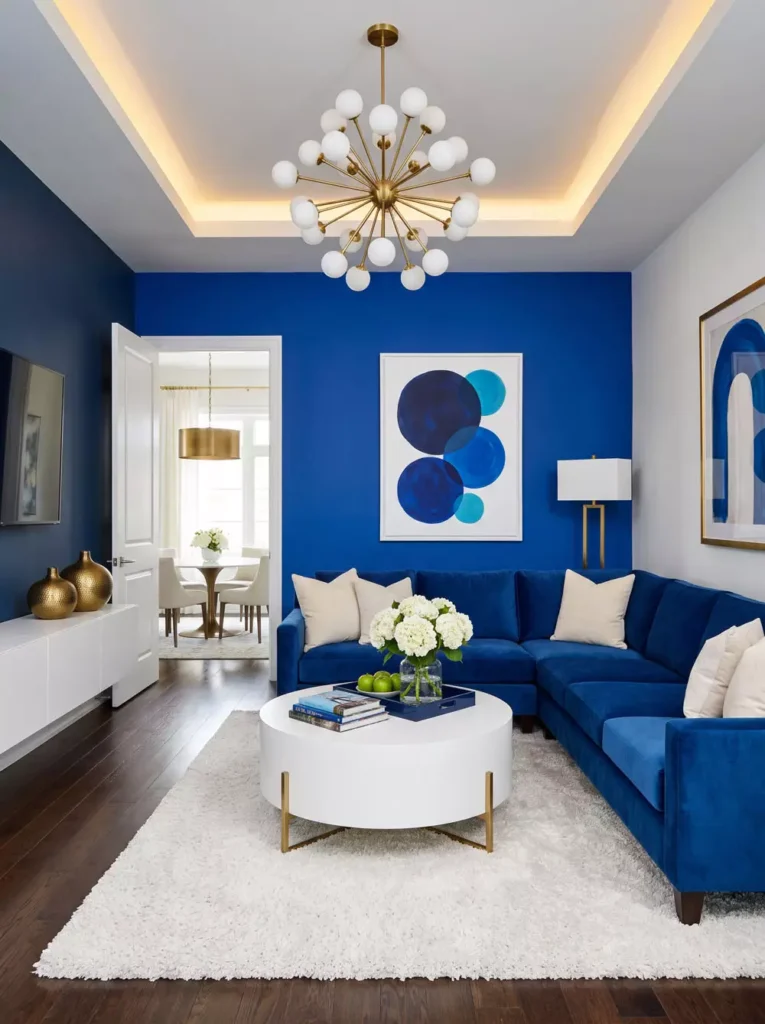
This room commits to blue from the accent wall right into the sectional. The sofa sits close to the wall color, but its softer velvet surface catches the light differently, so the two do not disappear into each other.
White tables, pale flooring, and the lighter walls around the blue feature give the deeper color plenty of breathing room. The effect is bold without making the entire room feel dark.
Glossy Blue, White Upholstery, and Gold Sparkle
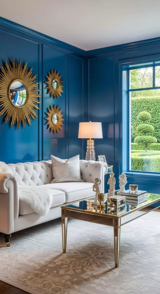
The slightly reflective blue walls give this room a polished feel before any decoration is added. Gold sunburst pieces look especially bright on the darker surface and spread interest across more than one part of the wall.
The pale tufted sofa creates a big visual break underneath. Without that lighter furniture, the combination of deep blue and metallic gold could feel much heavier.
There is plenty of glamour here, but it comes from a fairly controlled palette rather than lots of unrelated accessories.
Paneled Blue With Crystal Light
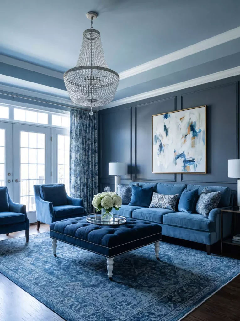
Blue wall paneling gives this room depth through its lines and shadows, while a large abstract artwork breaks up the more formal architecture. A crystal chandelier adds another layer of detail overhead.
Large windows, a pale ceiling, and lighter trim keep the deep blue from enclosing the room. The darker seating feels connected to the walls without turning everything into one solid block of color.
Gold Frames on a Deep Blue Wall
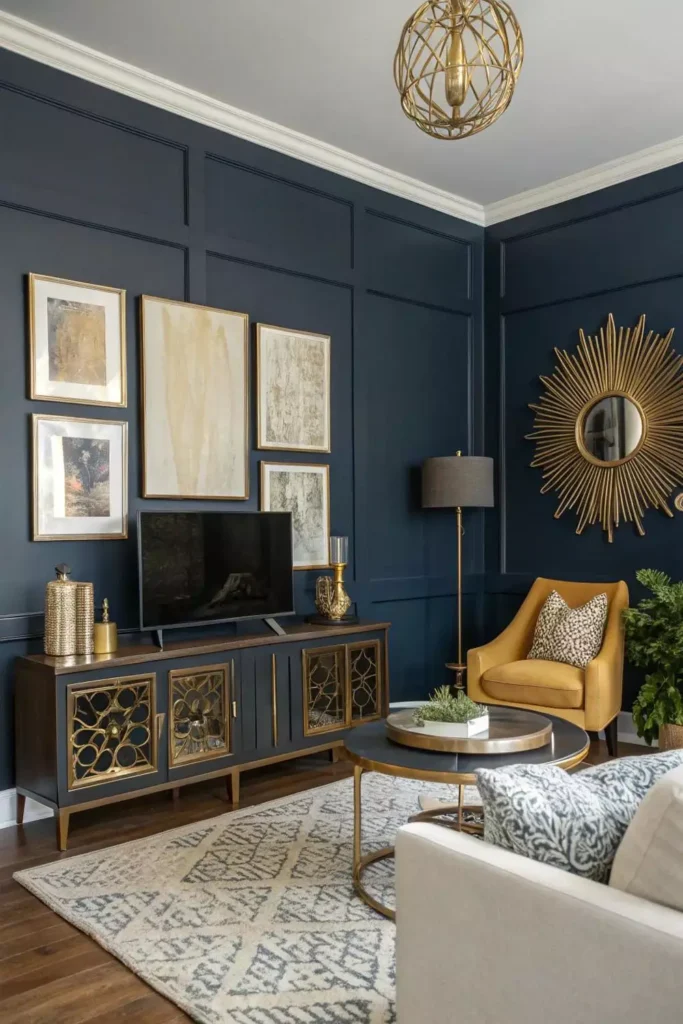
The dark blue wall makes the collection of pale and gold-toned frames look richer. Different sizes create a looser gallery rather than a strict repeated grid.
A gold sunburst piece and the warm mustard chair continue those warmer tones outside the frames, so the wall arrangement connects naturally with the furniture below.
This is one of those rooms where the paint is doing part of the decorating. Even relatively quiet artwork gains more presence on such a deep background.
Navy, Mustard Velvet, and a Sputnik Moment
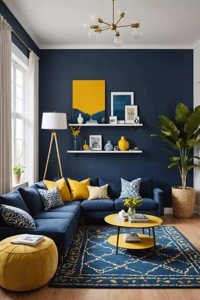
The navy feature wall is paired with mustard accents rather than another large field of yellow. Cushions, a low yellow seat, and the rectangular artwork give the darker blue several warm interruptions.
A gold Sputnik-style ceiling light carries that warmth above the seating area, while greenery near the window loosens up the sharper blue-and-yellow contrast.
Cobalt With Macramé and Plenty of Green
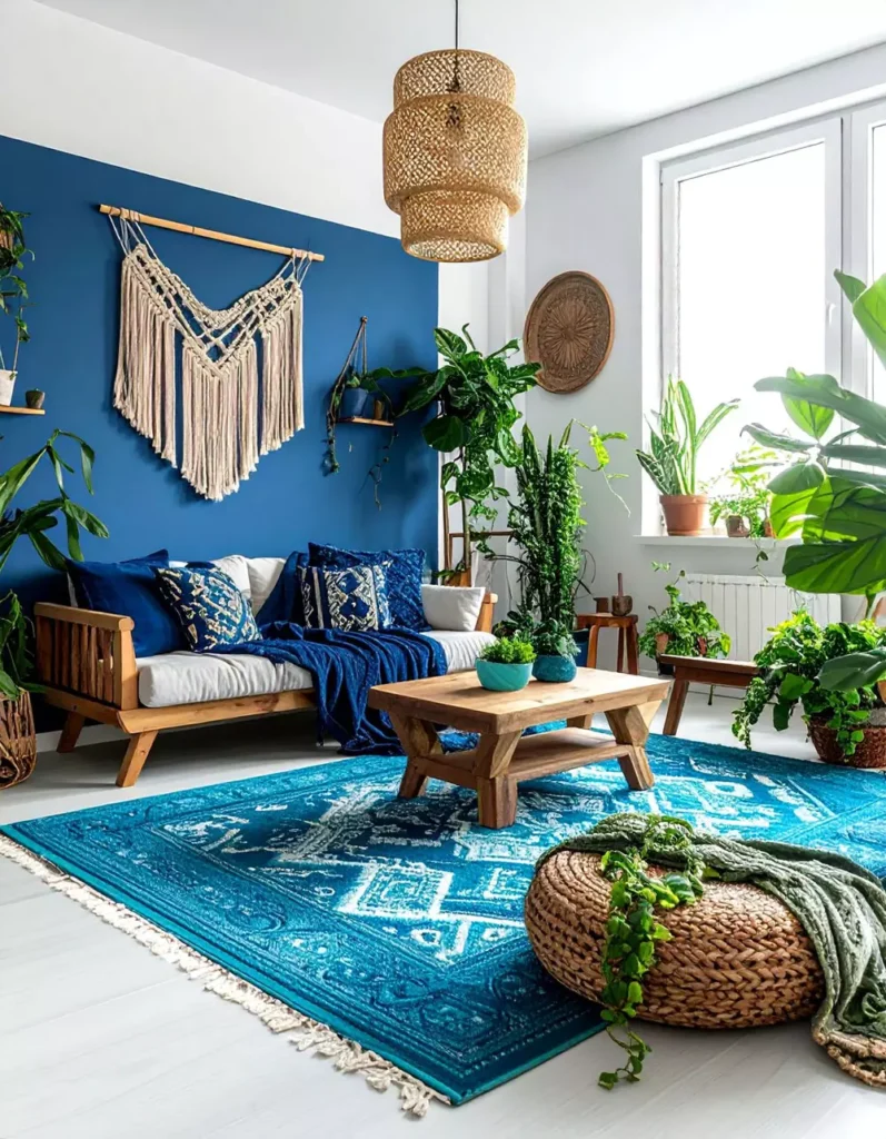
The cobalt wall is strong, but nearly everything around it makes the room feel softer. A large macramé hanging, leafy plants, wood furniture, and woven pieces introduce texture that plain framed art would not.
Plants appear at several heights rather than being grouped in one corner, so the greenery spreads naturally through the room. All that cobalt still feels lively, but the overall mood is relaxed and bohemian.
French Country Blue With Floral Pattern
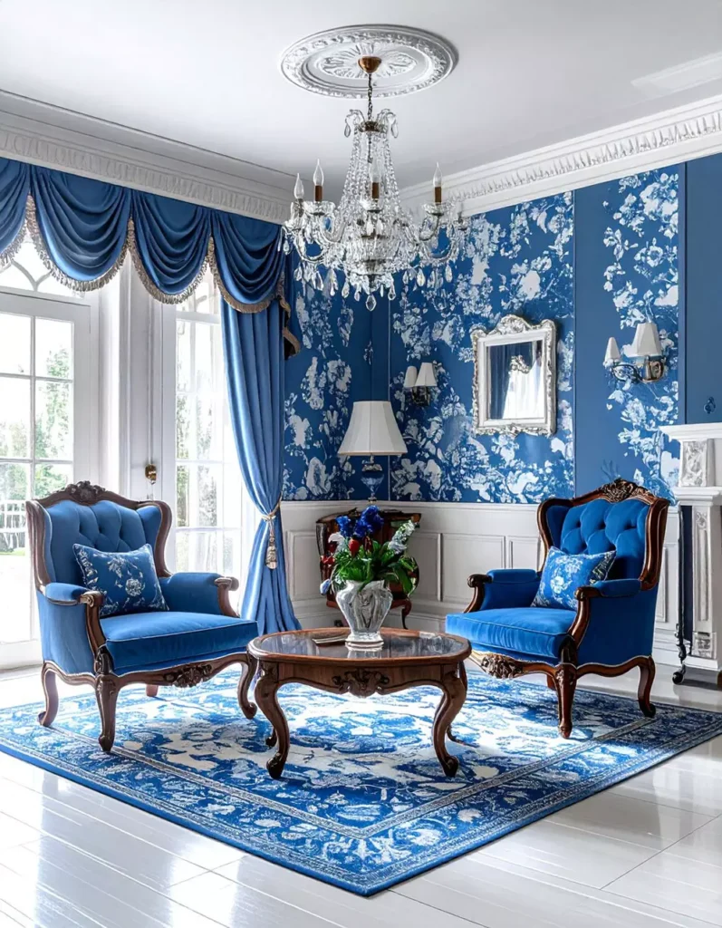
Blue floral wallpaper gives this room much more movement than a plain painted wall. Matching blue seating continues the color through the room, while white architectural details give the pattern a clear border.
The crystal chandelier suits the more traditional furniture and ornate window treatments. There is a lot to look at, but staying largely within blue, white, and neutral tones stops the space from becoming chaotic.
A Long Gallery Shelf Against Navy
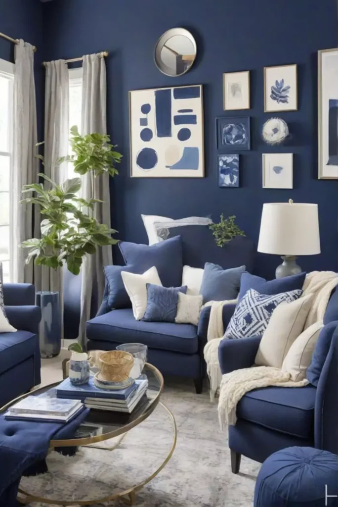
This navy wall holds a mixed gallery of framed pictures above two tufted blue armchairs. The frames vary in shape, size, and tone, so the arrangement feels collected rather than like a matching set.
Because the chairs repeat the wall color below, the gallery becomes part of one complete seating area. White curtains, pale cushions, and a light floor provide the contrast the darker blue needs.
Moody Blue With Warm Leather
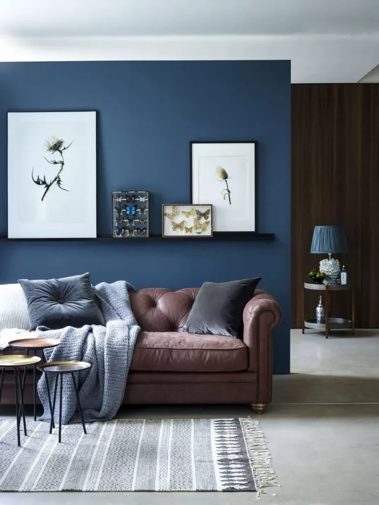
The brown leather sofa immediately changes the character of this blue wall. Its warm tone and softer, worn-in look make the dark background feel more comfortable rather than formal.
A striped rug and simple framed artwork keep the rest of the setup fairly restrained. That leaves the blue-and-brown relationship easy to notice instead of burying it under extra decoration.
Honeycomb Shelves and Knitted Poufs
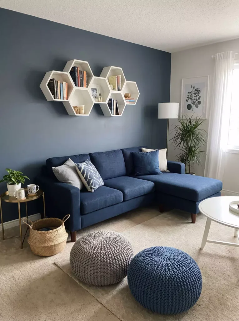
A cluster of honeycomb shelves turns the blue-gray wall into something playful and useful. Their pale interiors stand out against the darker paint and create several small display spaces without the visual weight of one long cabinet.
Knitted poufs bring a much softer shape to the floor, while baskets and small plants add more texture around the sectional. The room feels casual because the geometric wall feature is balanced by all those softer materials.
Skyline Art Against Navy

Two large black-and-white city photographs sit cleanly on the dark blue wall. Their monochrome palette gives the eye something graphic to focus on without introducing another strong color.
The white sectional provides a large bright area below, while the wood table adds a little warmth in the center. The navy almost behaves like a gallery backdrop for the photography.
Blue on Blue With Clear Globe Lights
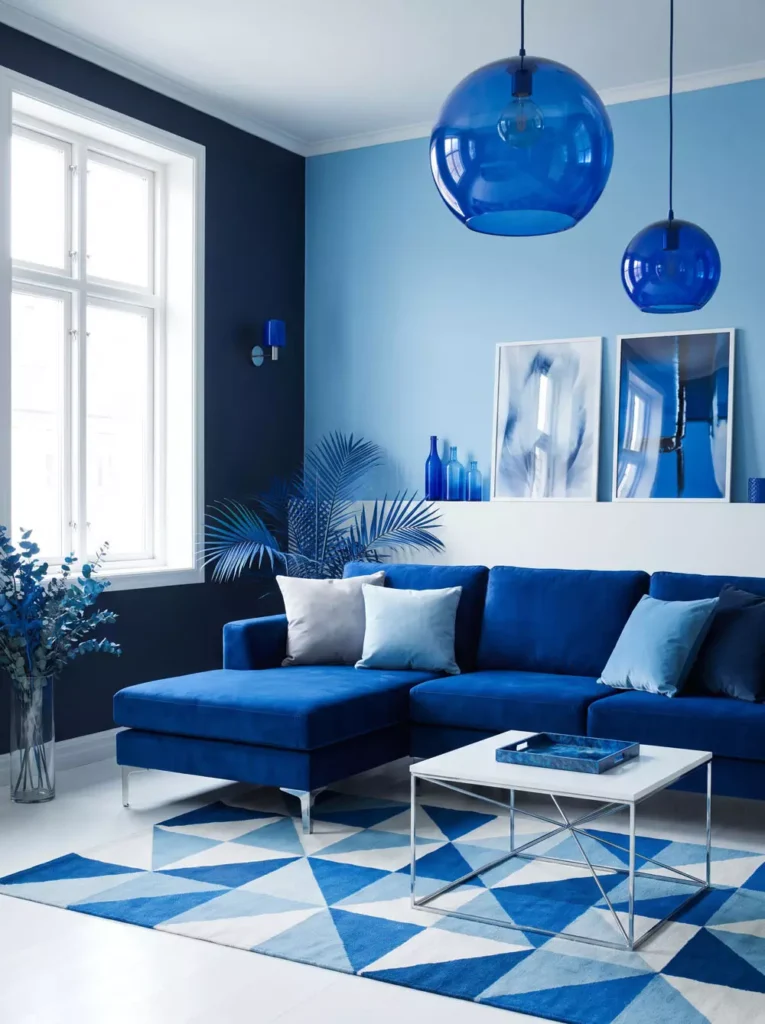
This room goes much further with the color, using blue across the walls, sectional, artwork, and the oversized glass pendant globes.
The shades are not identical. Deep cobalt, brighter electric blues, and softer upholstery tones give the room more depth than one repeated shade would. The geometric rug also breaks the palette into blue, white, and gray shapes near the floor.
Large windows and white architectural surfaces are important here. They give such a saturated room enough light and contrast to stay energetic rather than enclosed.
Pale Blue With Bright White Sofas
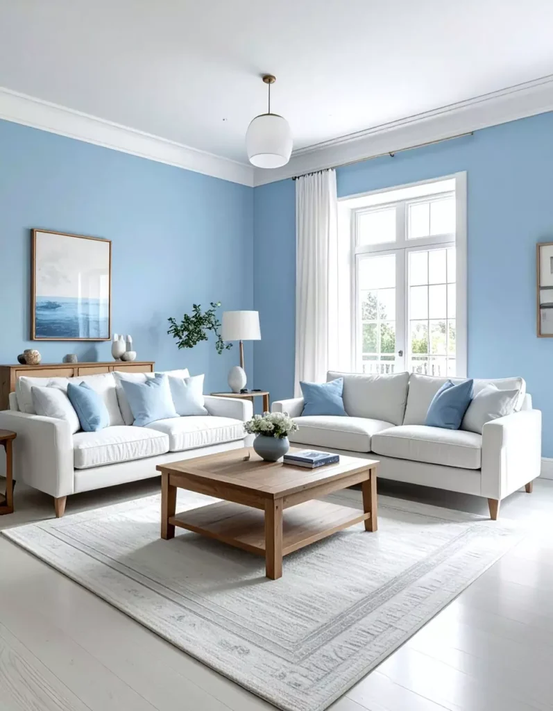
This is the quiet side of blue. Pale walls sit gently behind the white sofas, with stronger blue cushions adding just enough definition to the seating.
A warm wood coffee table interrupts all those cool, light colors in the center, while the generous daylight makes the wall behave almost like a soft neutral.
Teal With Gold Hexagon Mirrors
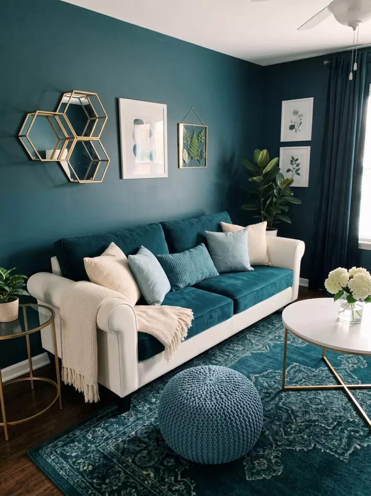
Several gold-edged hexagonal mirrors create the focal point on this teal wall. Their reflective centers break up the solid color while the repeated shape keeps the cluster neat.
The teal sofa stays close to the wall color, but pale cushions and the light furniture around it provide contrast. A chunky blue pouf introduces another softer texture near the floor.
Layering Several Blues in One Room
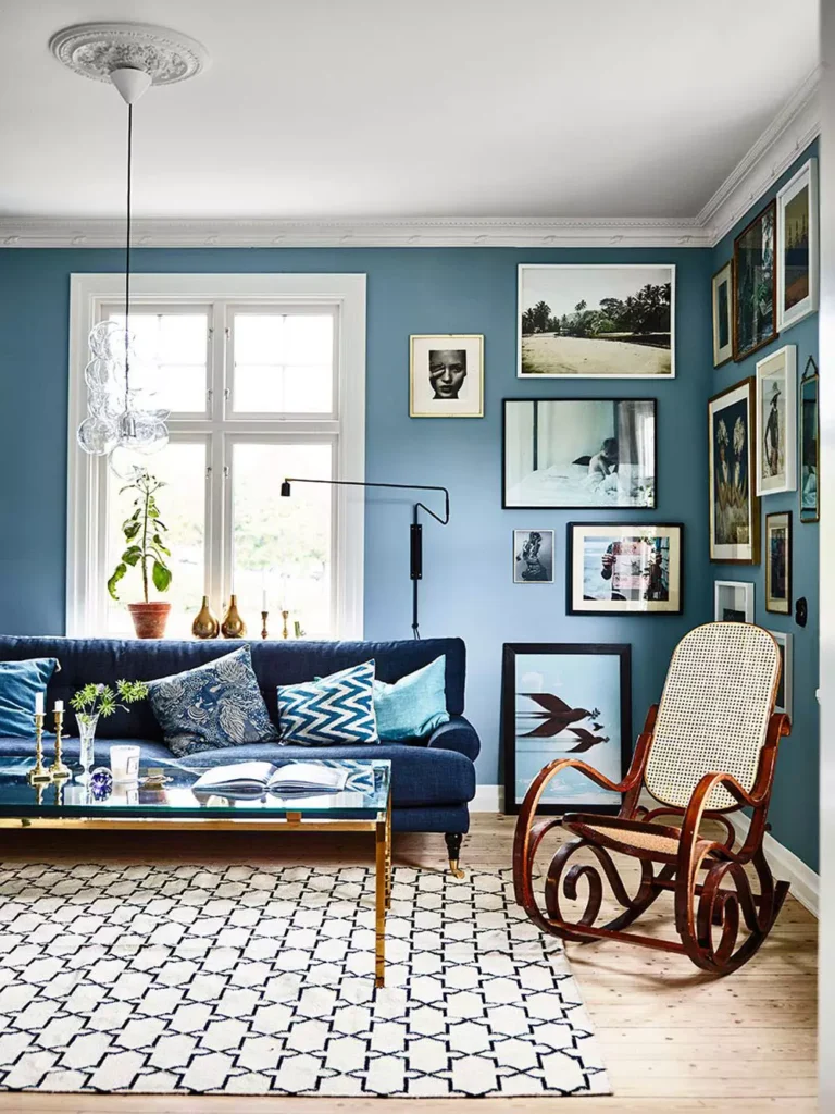
This room mixes different blues across the wall, sofa, textiles, and smaller details instead of matching one shade everywhere.
There is quite a lot on the walls too, with framed pictures, shelving, and objects creating a collected background. Warm wood furniture and the rocking chair are important because they interrupt the cooler palette with natural brown tones.
The overall effect feels lived in rather than perfectly coordinated. Blue ties the room together, but it is not the only thing allowed to have a personality.
Light Blue Walls With a Deeper Velvet Sofa
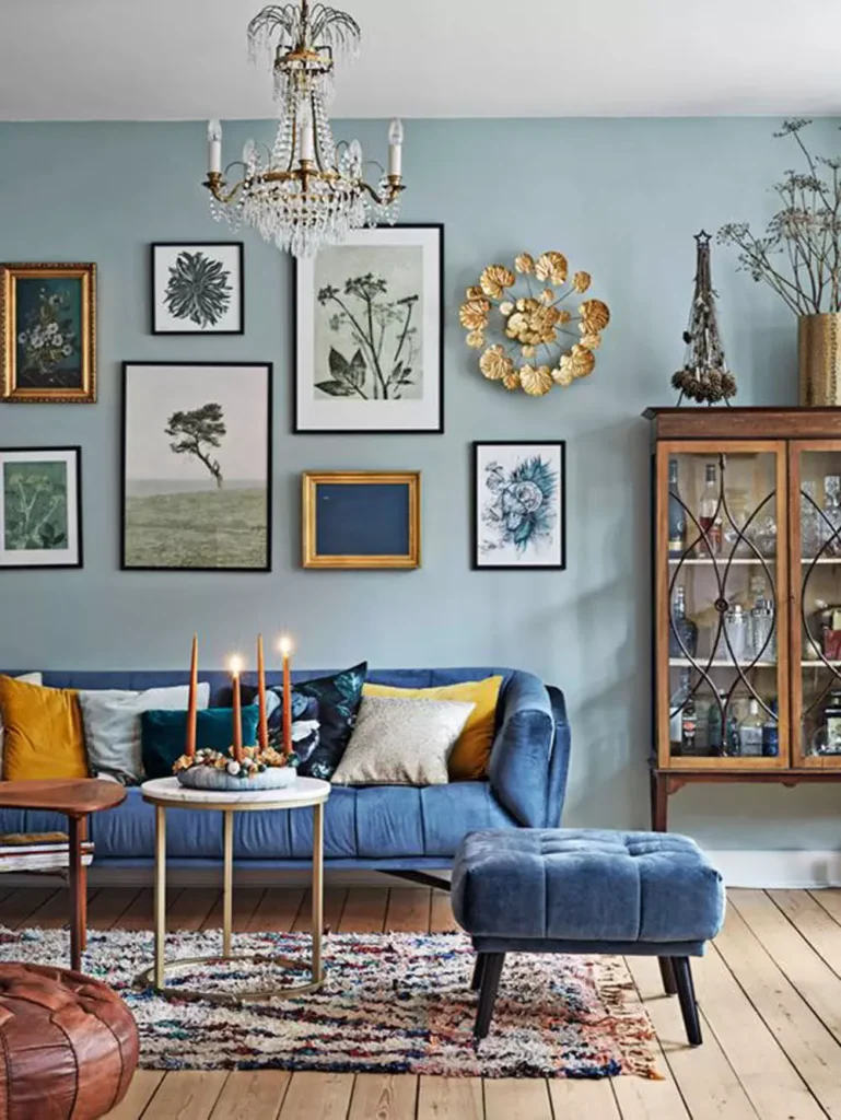
The pale blue wall gives the stronger blue velvet sofa plenty of room to stand out. Using a lighter version of the same color behind it creates depth without needing a completely different accent hue.
A varied collection of framed artwork introduces warmer gold, brown, and muted colors above the seating. The patterned rug does something similar below, so the room is not relying on blue alone for interest.
Dark Blue Paneling With Brass Starburst Detail
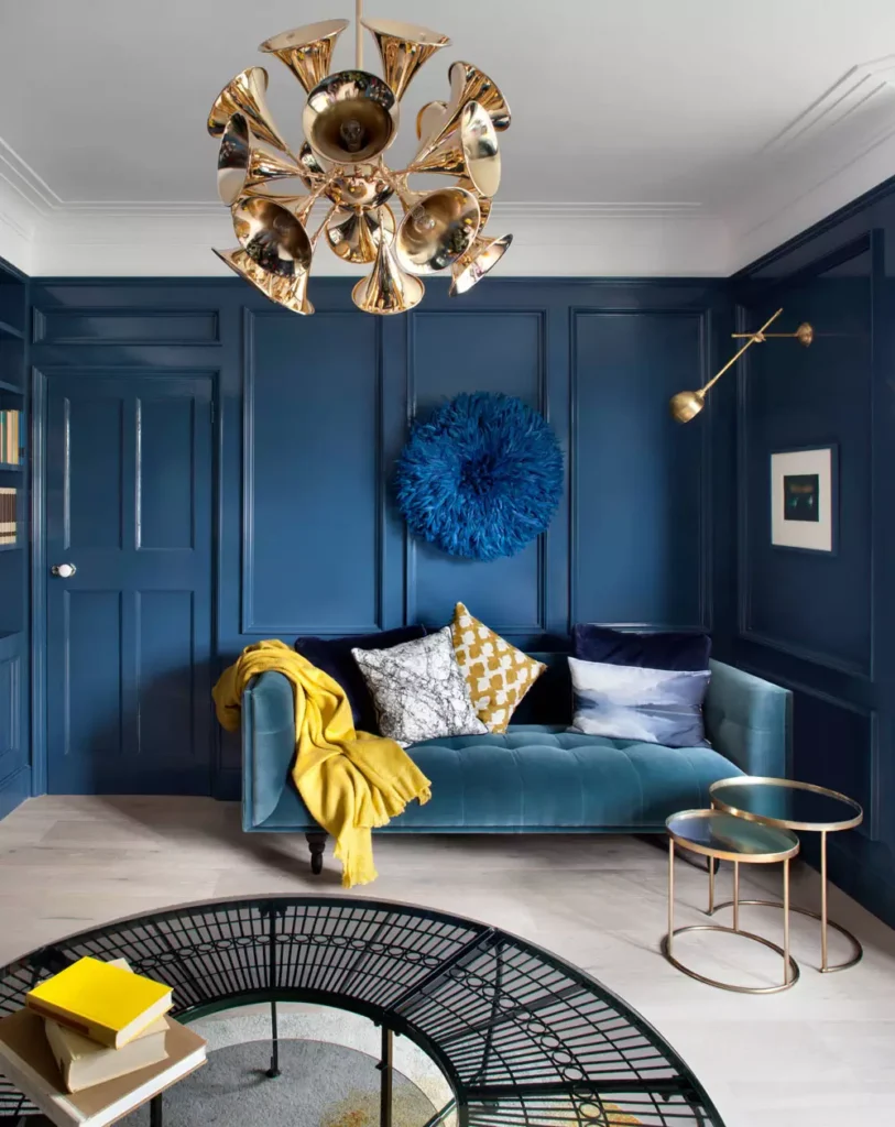
Deep blue paneling wraps this room in color, but the large brass-toned chandelier is what immediately pulls the eye upward. Its sculptural form looks especially bright against the dark ceiling and walls.
The blue sofa continues the wall palette below, while the vivid yellow throw creates one concentrated burst of warmth. A circular blue wall piece adds texture without introducing another competing color.
There is already a lot of architectural presence here, so the room does not need a crowded gallery wall to feel finished.
Navy With Tufting and Gold-Framed Mirrors
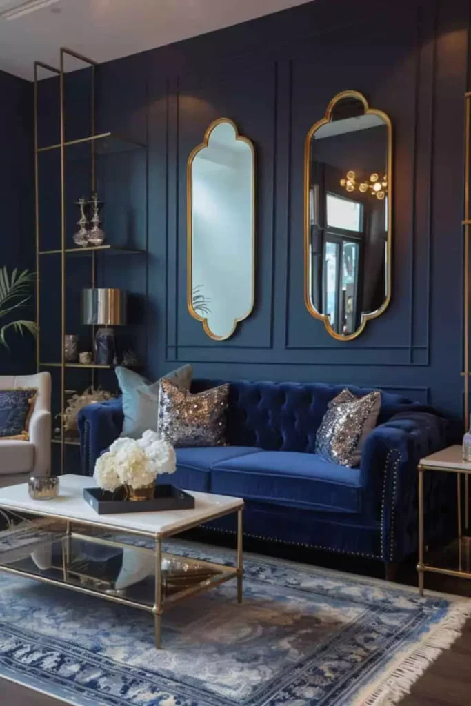
Two tall gold-framed mirrors break up the dark paneled wall above the tufted blue sofa. Their reflective surfaces bring light into a room that otherwise uses a very deep palette.
Gold appears again around the furniture, while the pale patterned rug brightens the floor. The mirrors add height as well as shine, which makes them feel more substantial than a few small frames would.
Coastal Blue With Striped Cushions
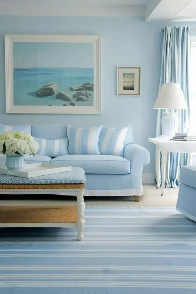
This pale blue room uses light upholstery, soft curtains, and striped cushions to create a breezier mood. Stronger blue appears in the textiles, but nothing becomes dark enough to weigh down the seating area.
The look feels coastal because of the airy palette and relaxed fabrics rather than obvious nautical objects. That makes the room easier to borrow from without turning your living room into a beach theme.
Deep Blue With Cozy Leather Seating
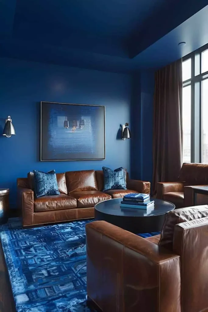
Deep blue covers far more of this room than a single feature wall, creating a darker, enclosed atmosphere around the seating area.
Brown leather sofas introduce a warm earthy contrast, while the large patterned blue rug gives the floor enough detail to hold its own against the walls. Smaller warm tones in the furniture stop the blue from feeling cold.
The room feels comfortable rather than pristine. That slightly heavier, lived-in character suits the dark paint.
Rattan and Woven Texture Against Blue
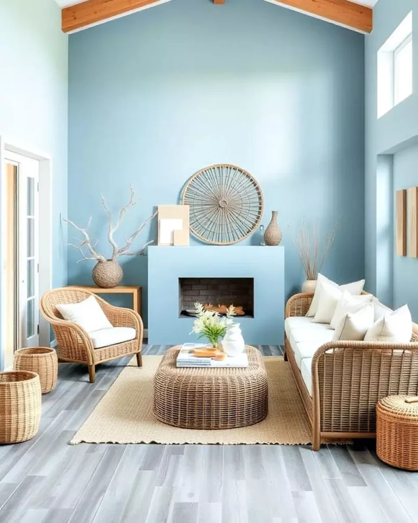
Pale blue walls make the warm rattan furniture stand out immediately. The natural tan color adds warmth, while woven surfaces introduce texture without needing lots of extra wall pieces.
The room stays airy because the furniture has open frames and the palette is mostly light. It feels coastal, but the mood comes from the materials and color rather than shells, signs, or obvious seaside motifs.
Deep Blue With Crystal Overhead
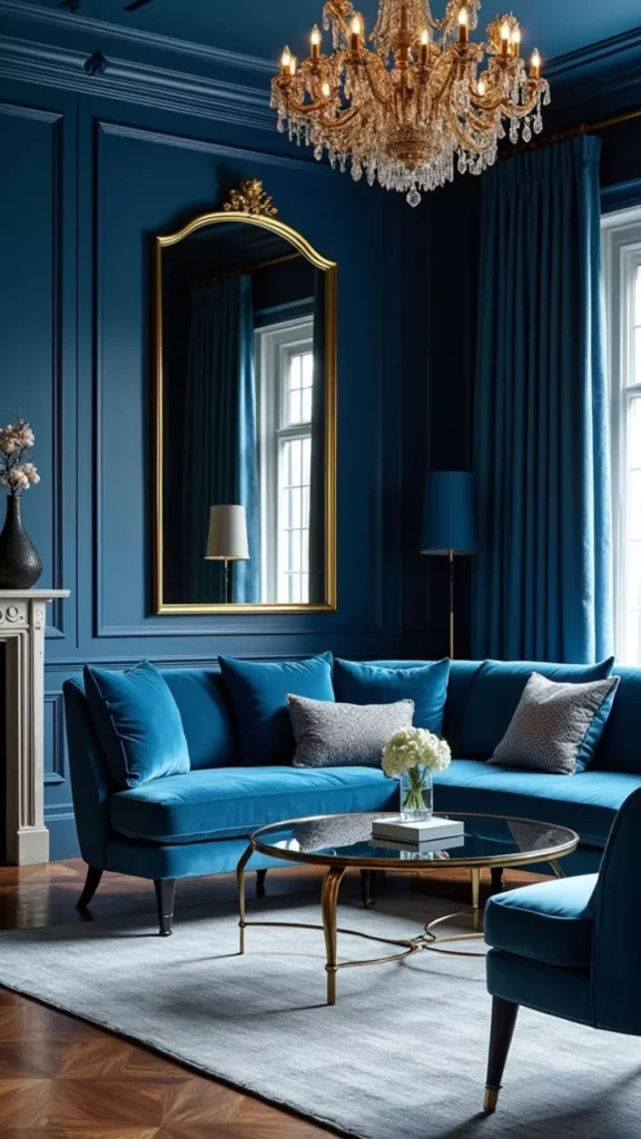
This room leans fully into drama with dark blue paneled walls, velvet seating, and a large crystal chandelier. The chandelier becomes especially noticeable because its light and reflective detail sit against such a deep background.
Gold-framed mirrors and warm metallic accents add more brightness around the walls, while the seating stays within the same rich blue family.
It has a jewel-box quality, but the lighter floor and reflective surfaces stop all that dark color from becoming visually flat.
Deep Teal With Botanical Art
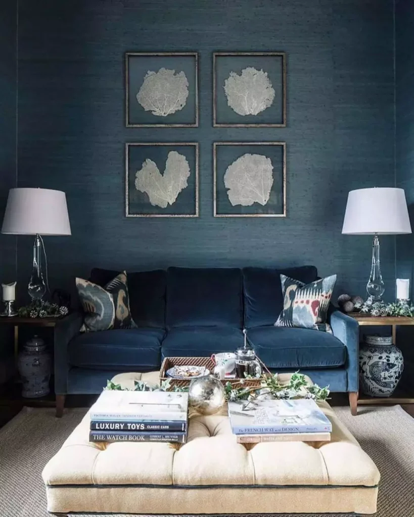
Four botanical prints are arranged in a simple grid on the deep teal wall. Their pale backgrounds stand out clearly without needing oversized frames or a much larger gallery.
The dark sofa below stays close to the wall color, while the cream ottoman and two pale lamps lighten the lower half of the room. The symmetry makes this one feel calmer than many of the more collected gallery arrangements earlier in the article.
Cobalt Over Cool Gray Flooring
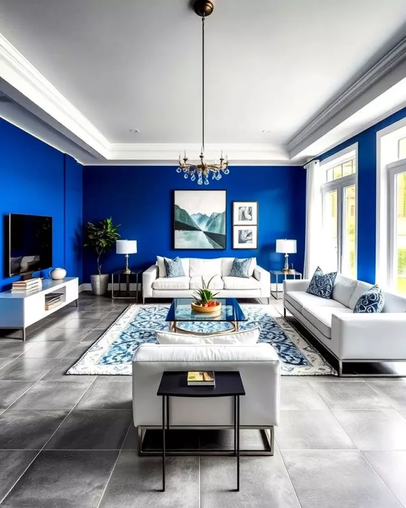
Cobalt walls and cool gray tile flooring give this room one of the sharpest color combinations in the set. Instead of warming the blue with wood or leather, the floor pushes it in an even cooler, more modern direction.
White sofas and the large windows are what make that strong color manageable. The room feels crisp and graphic rather than cozy, and that suits the clean architecture.
Moody Navy With a Vintage-Style Rug
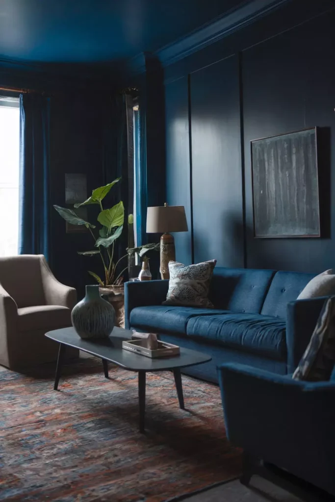
This dark blue room is intentionally subdued, with the walls, sofa, and much of the furniture sitting in similarly deep tones.
The vintage-style rug changes that mood at floor level. Muted reds, browns, blues, and worn-looking pattern bring warmth into an otherwise very dark palette.
A few plants and lighter surfaces around the room add smaller breaks, but the rug does most of the balancing.
That is useful if you already love your dark walls: you do not necessarily need more wall decor to soften them. Sometimes changing what happens underfoot has the bigger effect.
Warm Wood Against a Blue Accent Wall
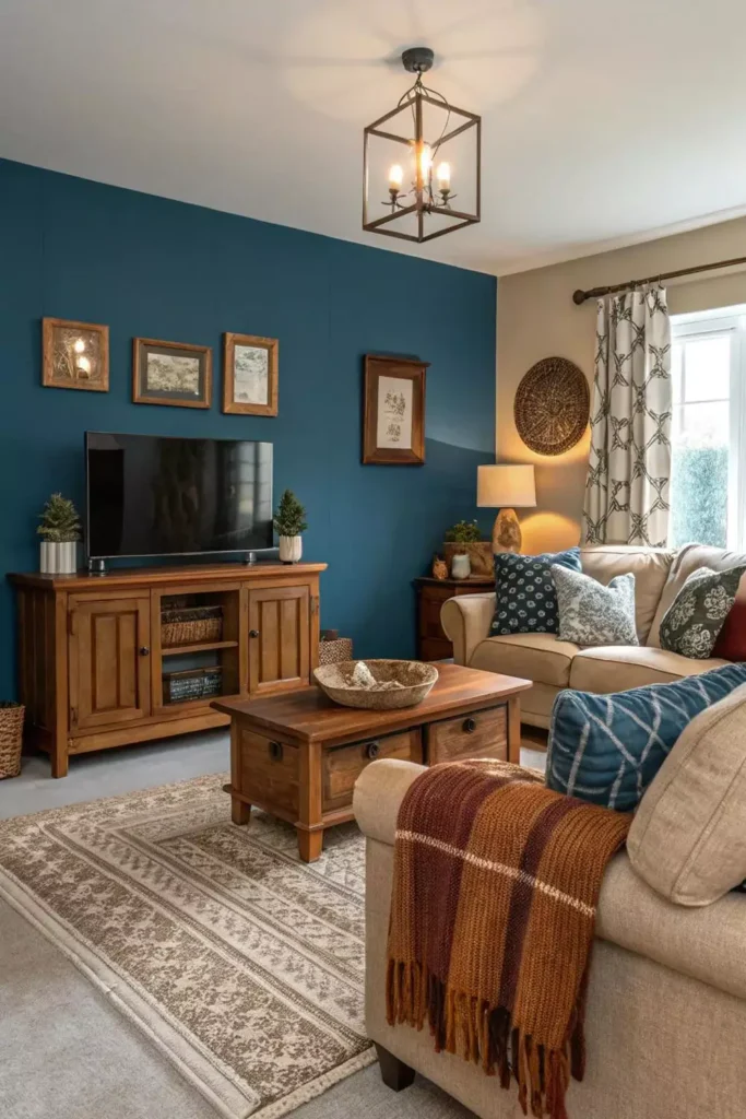
The blue accent wall sits behind warm wood furniture, including the substantial console and coffee table. Those brown tones make the cooler paint feel much more comfortable.
Small framed pieces on the wall add warm metallic and earthy notes rather than introducing another strong color. The rug and upholstered seating continue that softer palette through the foreground.
It is one of the simpler combinations in the article, but that is part of why it works. The contrast between blue paint and natural-looking wood already gives the room enough interest.
Blue Can Be More Than One Mood
Pale blue can make a living room feel open and breezy. Navy can turn the same kind of space into something much moodier. Add mustard and it becomes playful; bring in leather and it feels warmer; pair it with brass or crystal and suddenly the room leans more polished.
That range is what makes blue so useful. You do not have to build the whole room around the wall color. Give it a few good neighbors—wood, white, gold, plants, patterned textiles, or another shade of blue—and let the combination decide where the room goes.