
A room usually feels more finished when the wall decor has some relationship to what is already happening below it. A wide sofa can handle something large, a staircase needs an arrangement that follows its slope, and a narrow bathroom wall often works better with shelves or a compact cluster than one oversized piece.
These wall decor ideas cover a wide range of approaches, from framed photography and gallery walls to mirrors, carved panels, plates, floating shelves, sculptural pieces, and architectural wall treatments. The interesting part is not just what goes on the wall, but how the size, spacing, shape, and placement work with the furniture and architecture around it.
An Oversized White Flower Above a Neutral Sofa
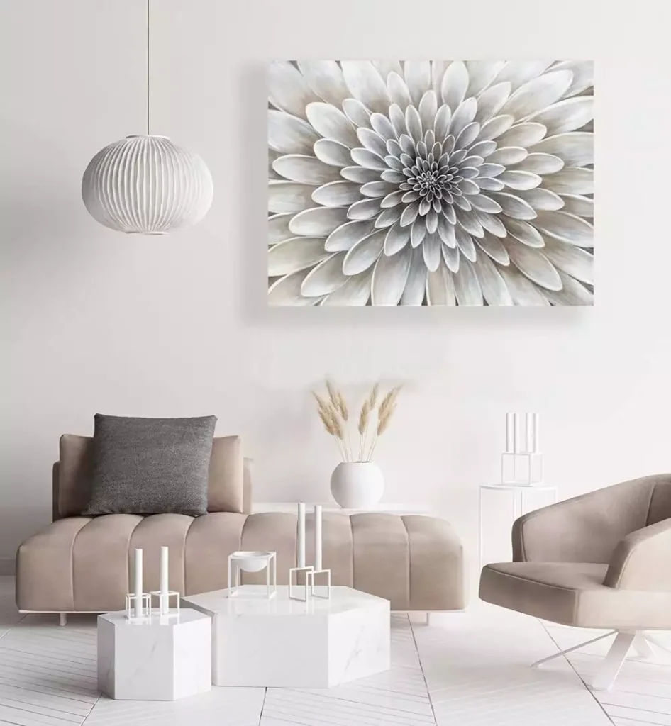
A single large floral canvas fills most of the wall above the sofa, so there is no need for a second piece beside it.
The pale petals sit comfortably with the cream and taupe furniture, but the size gives the room a clear focal point. Because the artwork is nearly as wide as the seating area, it feels properly connected to the sofa instead of floating in the middle of the wall.
This is a good example of scale doing more than color.
Three Geometric Prints in a Warm Living Room
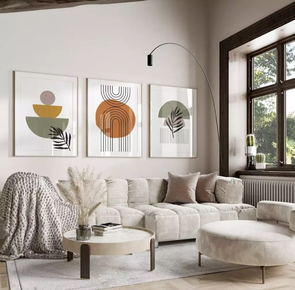
Three matching prints create a clean horizontal line above the sofa, with soft mustard, rust, and green tones repeated across the set.
The identical frame size keeps the grouping calm, while the tall floor lamp beside it adds height so the whole wall does not feel too flat.
A trio like this works well when you want the effect of a gallery without the visual complexity of many different frames.
A Round Gold Statement Above an Accent Chair
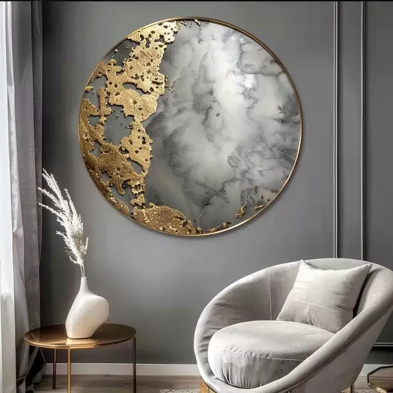
This circular wall piece breaks up a room filled with straight furniture lines and rectangular architecture.
Gold detailing around the edge catches light against the darker wall, while the marbled center keeps the surface from feeling too shiny. Its round shape also relates nicely to the curved chair below.
A single sculptural piece can work especially well in a smaller seating corner where a full gallery would be too much.
A Layered Photo Display Above the Bed

Several framed nature photographs hang in a loose row above the carved wood bed.
The frames are similar enough to feel connected, but the slightly varied heights stop the display from becoming too formal. Because the headboard already has a lot of detail, the photographs stay relatively quiet. The result feels collected rather than heavily styled.
A Carved Wood Panel Behind the Bed
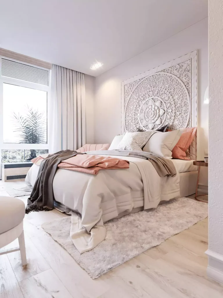
Instead of conventional artwork, a large carved panel becomes the main feature behind this bed.
The symmetrical pattern stretches across most of the headboard width, giving the wall strong presence without adding multiple objects. Its pale finish also keeps all that carving from feeling visually heavy.
When a wall piece is this detailed, giving it room to breathe usually works better than surrounding it with extra frames.
Diamond Mirrors Against Reclaimed Wood

Three diamond-shaped mirrors sit close together above the bed, creating one compact geometric cluster. The reflective surfaces stand out clearly against the darker wood-plank wall, and the angled shapes contrast with the horizontal lines in the boards.
Because the accent wall already has plenty of texture, the mirrors add light without covering too much of it.
Floating Shelves with Simple Everyday Objects

Two wood shelves turn a narrow wall section into useful display space.
Candles, a plant, small vessels, and a woven wall piece bring different textures without filling every inch. Leaving gaps between the objects makes the shelves easier to read and keeps the arrangement from feeling like storage overflow.
This is one of the more practical ideas in the set because the wall can change whenever the objects do.
Family Photos Following the Staircase

Framed family photographs climb the wall in the same direction as the stairs. That upward movement is what makes the arrangement feel natural here. A flat rectangular gallery would fight the staircase geometry, while this one follows it.
Keeping the frames mostly similar in color gives the collection some order even though the photo sizes vary.
Hanging Photo Clusters in an Entryway

This hallway uses photographs in a much looser way, with small hanging clusters spread around a larger name sign.
The arrangement feels more casual than a traditional framed gallery, which suits the entryway setting. Different heights help the wall feel active without forming one solid block.
It works because the photos share one general zone instead of being scattered across the entire hallway.
Oversized Letters Mixed with Family Photos

Large dimensional letters dominate this narrow wall, while a few photographs and smaller decorative pieces fill the spaces between them.
The bold scale makes the arrangement easy to see from farther down the hallway. Because the letters are already visually strong, the surrounding pieces stay smaller.
This kind of layout works best when the larger elements are placed first and the smaller ones fill the gaps afterward.
Black-and-White Southwestern Art Above a Sofa

A central framed photograph is flanked by graphic black-and-white prints, creating a balanced display over the seating area.
The darker artwork connects nicely with the patterned cushions below, while the warm leather and woven pieces stop the room from feeling overly monochrome. The symmetry helps here because the prints themselves already have strong patterns.
One Black Leaf Print Above a Four-Poster Bed
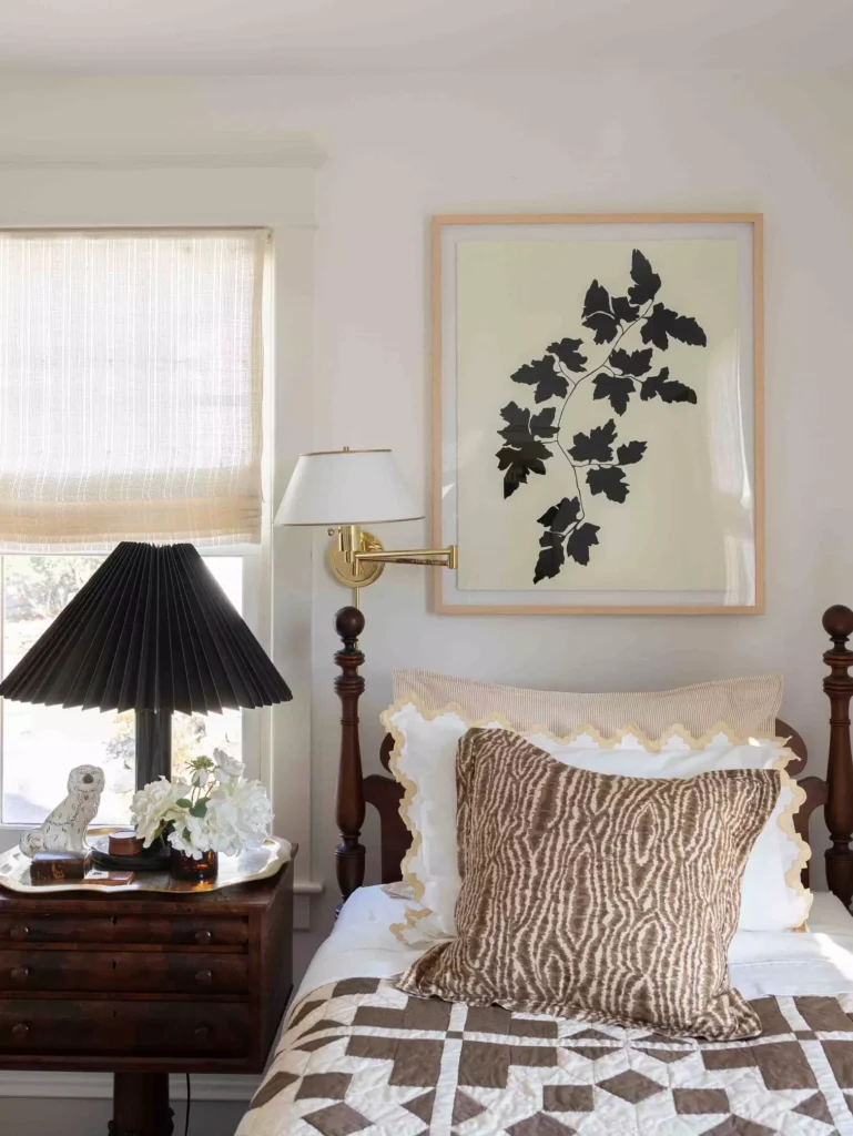
A single botanical silhouette sits centered above the bed, and that restraint suits the strong four-poster frame around it.
The dark leaf echoes the darker wood without competing with the furniture’s vertical lines. A larger gallery in the same spot would make the headboard area feel much busier. Sometimes one properly scaled print is enough.
Typography and Shelves in a Dark Bathroom
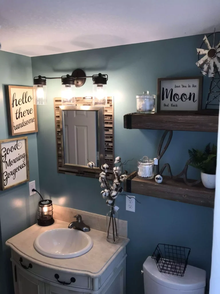
This compact bathroom combines framed signs with small wood shelves instead of relying on artwork alone.
The light lettering stands out clearly against the darker wall, while the shelves add enough depth for plants and small objects. Because the room is narrow, everything stays close to the wall rather than projecting far into the space.
That mix of storage and decoration makes good use of a wall that would otherwise be mostly empty.
A Vintage Mirror with Small Framed Art
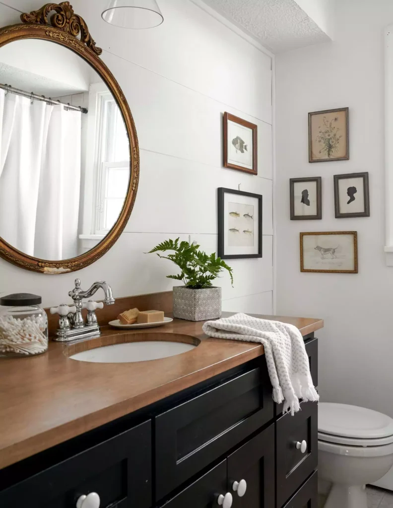
A decorative gold mirror anchors this bathroom wall, with smaller framed pieces arranged around it.
The different frame shapes make the grouping feel collected, but the warm gold tones help tie the pieces together. The mirror remains the largest object, which gives the eye a clear place to start.
For mixed-frame galleries, having one dominant piece can stop the wall from feeling random.
Floating Fabric Discs on a Tall Wall

This double-height wall uses large translucent discs instead of framed artwork.
Their staggered placement creates a loose vertical trail that takes advantage of the wall height, while the sheer material keeps the installation from becoming visually heavy.
A conventional small frame would disappear in a space this tall. The scale and direction are doing almost all the work here.
A Gallery Wall with Clocks Mixed In
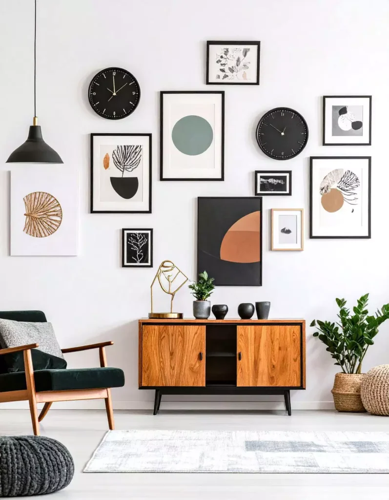
Framed prints and round clocks share the wall above a mid-century sideboard. The circular clock faces break up all the rectangles and make the grouping more visually varied. Keeping the display concentrated above the furniture gives the collection a clear boundary.
Function fits into the wall decor naturally here instead of looking like an afterthought.
Layered Signs in a Small Entryway
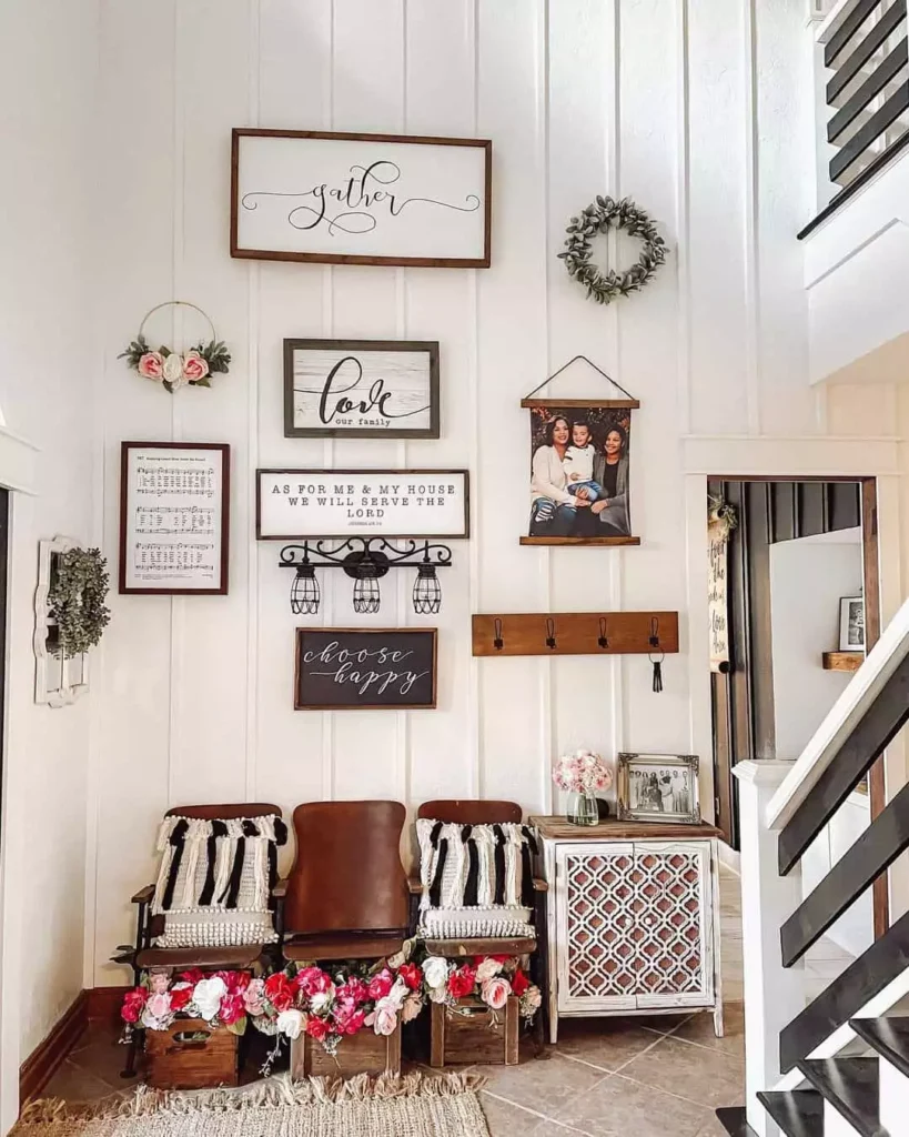
This wall mixes wood signs, framed pieces, a wreath, and a hanging photo in one compact area.
The different shapes create plenty of interest, but the mostly neutral palette stops the display from becoming chaotic. Because the bench below is fairly simple, the wall can carry more detail. The arrangement feels intentionally dense rather than accidentally crowded.
Floating Shelves Above a Bathroom Toilet

Stacked wood shelves make practical use of the narrow wall above the toilet.
Small plants, jars, and decor pieces sit on the shelves, while a framed sign occupies the upper section. The arrangement uses the wall height without filling the bathroom with additional furniture.
In a small room, vertical storage can be more useful than trying to add another cabinet.
Art Layered Over a Painted Color Block
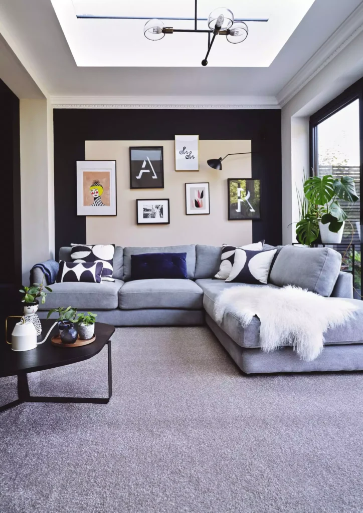
This gallery gets extra depth from the painted shape behind it. A warm neutral block creates a visual background for the framed typography and prints, making the whole group feel more deliberate than if the frames were placed directly on the plain wall.
The paint effectively becomes another layer of the composition without taking up any physical space.
Vintage Plates Arranged in a Diamond
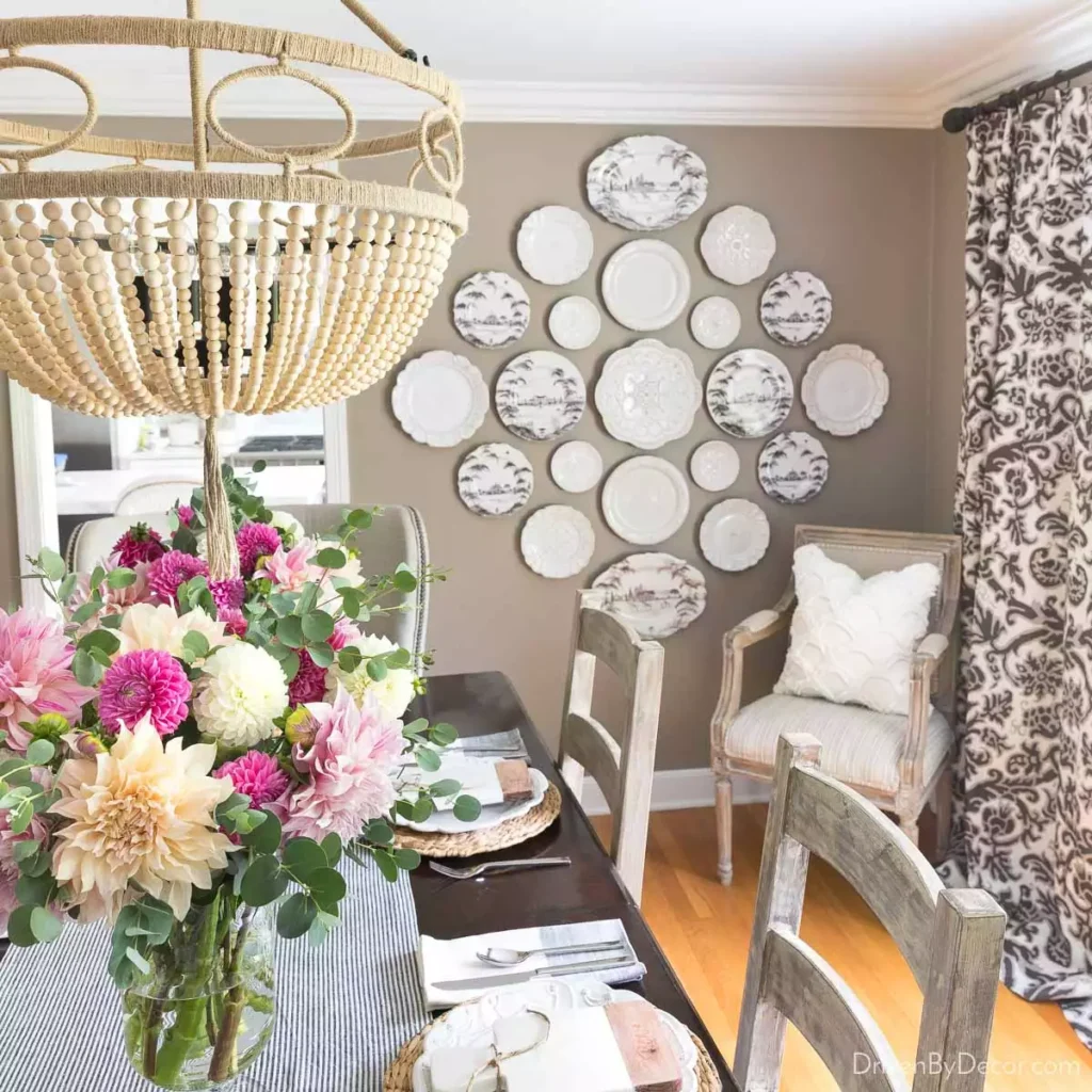
A collection of patterned plates forms a large diamond above the dining chairs.
Different plate sizes keep the arrangement lively, while the overall diamond shape prevents the collection from looking random. The circular pieces also provide a nice contrast to the straight furniture lines below.
This is a good way to use smaller decorative objects as one larger wall feature.
A Dense Staircase Gallery with Mixed Frames
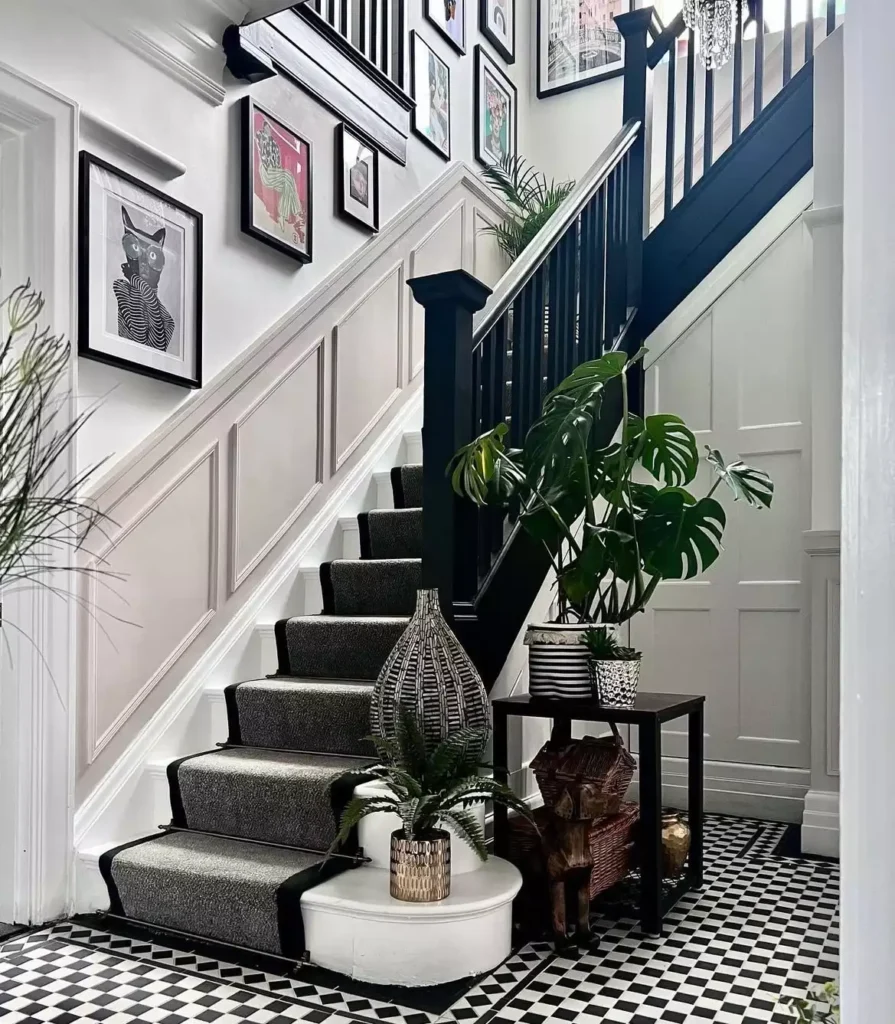
This staircase embraces a much fuller gallery wall, using many frame sizes and artwork styles.
The display follows the stairs upward and fills nearly the entire wall, but small gaps between frames keep each piece visible. The black-and-white floor pattern below already has a lot of energy, so the gallery feels intentional in such a visually active space.
This approach works because the density is consistent rather than concentrated in one awkward patch.
A Sunburst Mirror on Exposed Brick

The large sunburst mirror creates an immediate focal point against the textured brick wall. Smaller artwork nearby introduces softer color and shape, while the rough brick acts almost like a background pattern of its own.
The mirror has enough scale to stand up to that strong wall texture instead of getting lost against it.
Two Framed Prints Along a Stairwell

This stairwell takes the opposite approach from the dense galleries. Only two framed pieces line the wall, leaving plenty of empty space around them. Their similar size and alignment make the arrangement feel deliberate without requiring a full collection.
It is a useful reminder that a staircase does not automatically need dozens of frames to feel finished.
A Wall Quote Paired with Family Photos
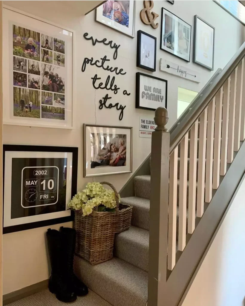
A cursive wall quote fills the upper portion of this staircase wall, with a framed photo collage placed nearby.
The lettering creates a broader horizontal shape, while the photograph adds a more structured rectangle beside it. Together they fill the awkward wall area without needing a large gallery. Keeping the two elements visually separate helps both remain readable.
Large Gold Line Art Above a Cream Sofa

This oversized artwork uses sweeping gold lines across a warm neutral background, making it feel almost architectural.
The cream sofa underneath gives the metallic detail plenty of contrast without introducing another strong color. Its wide proportions also match the scale of the seating area well.
The artwork is bold enough that the rest of the wall can stay completely clear.
A Full Vintage Gallery Above a Sofa
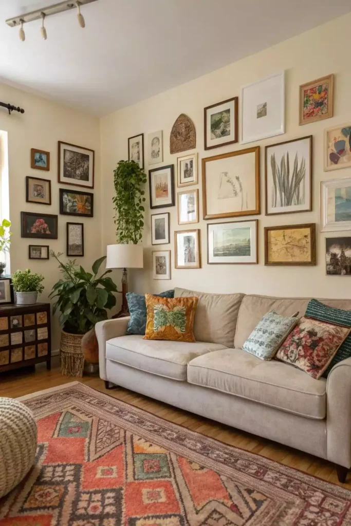
This wall is intentionally dense, with many vintage-style frames arranged tightly above the sofa.
Wood and dark frame tones help connect the different artworks, while the neutral sofa gives the whole display a quiet base underneath. The variety feels collected over time rather than perfectly matched.
For a gallery this full, repeating a few frame finishes can provide enough unity without forcing every piece to look identical.
Gold Diamond Frames Above a Neutral Sofa
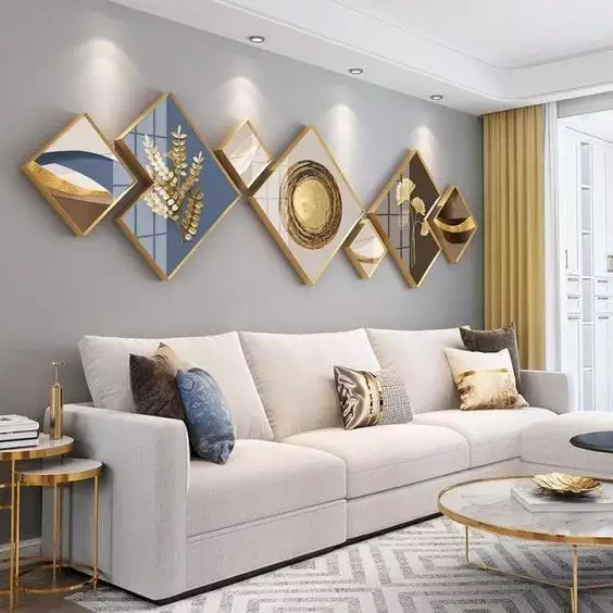
Several diamond-shaped frames spread horizontally above the sofa, creating a more sculptural alternative to ordinary square artwork.
Different internal designs stop the pieces from looking duplicated, while the repeated gold frames tie them together.
The cluster works because the overall width relates to the sofa below. If the group were much smaller, it would feel disconnected from the furniture.
Black-and-White Photography Along the Stairs

A series of framed photographs climbs the staircase in a loose but controlled arrangement. Using black-and-white images gives the gallery a consistent visual language even though the frame sizes and orientations vary. That helps the wall feel active without becoming messy.
The staircase itself determines the direction, so the display feels naturally integrated with the architecture.
Decorative Wall Paneling with Symmetrical Sconces

This wall does not rely on framed art at all. Geometric paneling creates the main pattern, while two matching sconces reinforce the symmetry around the central console. The wall treatment adds depth through shadow and line rather than through separate decorative objects.
When the architecture is already this detailed, adding more art would probably weaken the clean effect.
A Bare Wall Above a Sectional
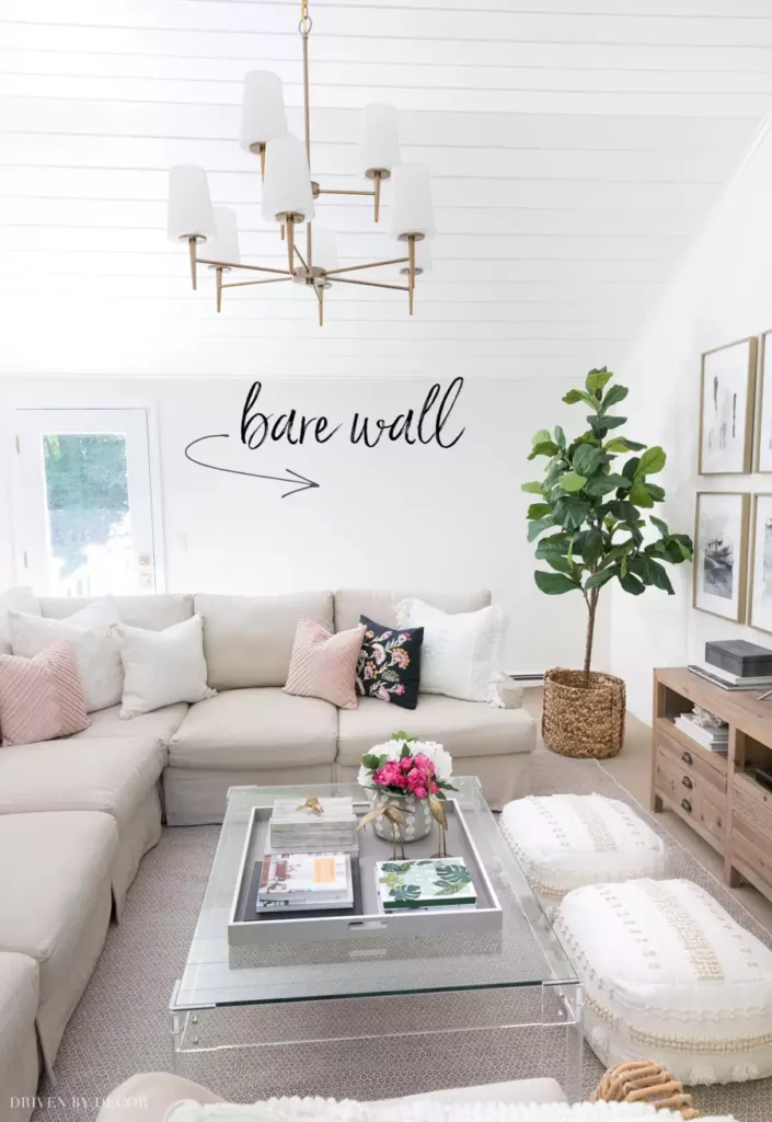
This image is useful precisely because the wall is mostly empty.
The sectional fills a large portion of the room, but the blank space above it makes the seating area feel less anchored. It shows why wall scale matters: a tiny print would still leave most of this surface unresolved.
A wall this broad could handle one oversized piece, a wider gallery, or another installation with enough width to relate to the sectional.
A Tapestry Beside a Colorful Gallery Wall
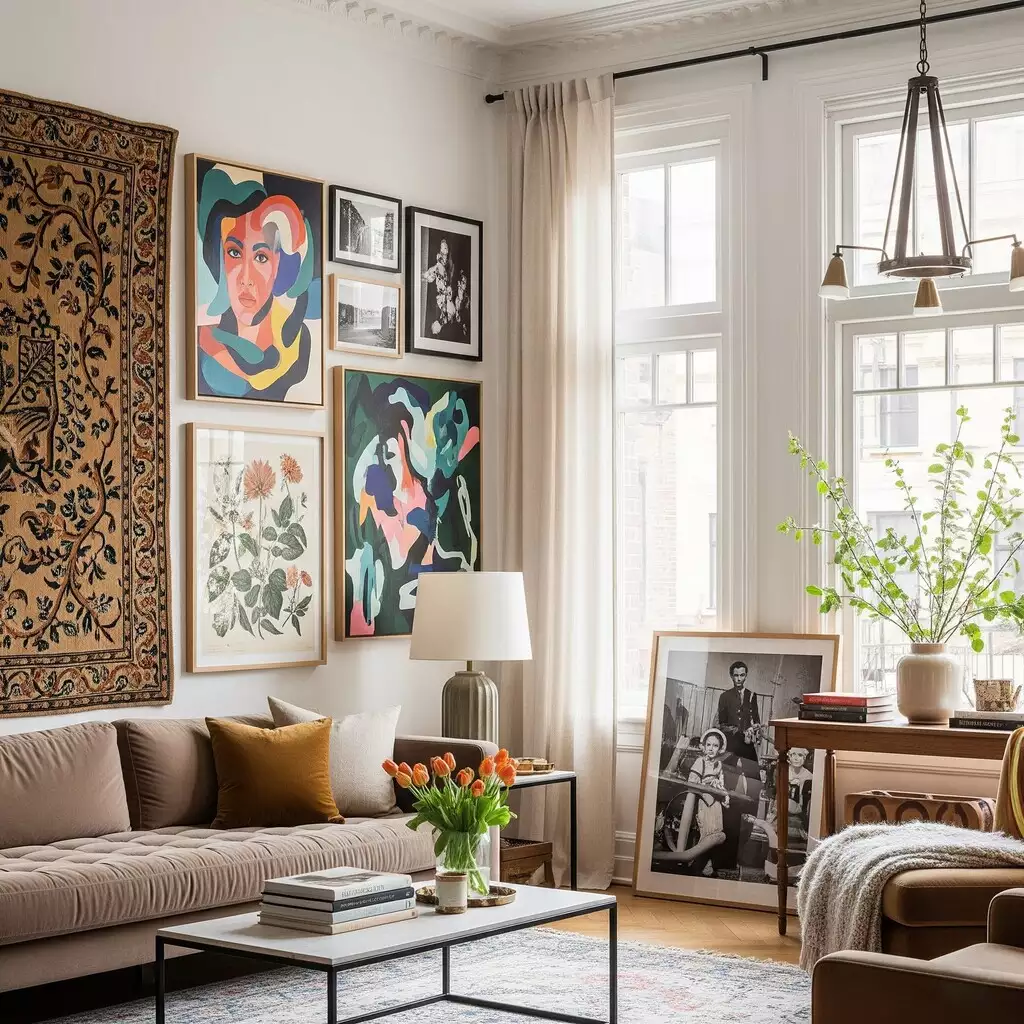
This living room mixes a large textile with a collection of framed artwork instead of choosing one format.
The tapestry brings a softer, heavier texture, while the gallery adds sharper lines and brighter color. Because the two groups sit beside rather than on top of each other, each keeps its own identity.
The combination feels layered without forcing every wall piece to match.
From Blank Space to Something Worth Looking At
A wall can change a room without becoming the busiest part of it. Sometimes the right answer is one oversized piece above a sofa. Somewhere else, it might be a staircase full of photographs, a carved panel behind the bed, floating shelves in a bathroom, or a collection of plates that turns into one larger composition.
What makes these ideas work is how closely they respond to the space around them. The width of the furniture, the height of the wall, the shape of a staircase, and even the texture already on the surface can all point you toward a different solution.
That is what keeps wall decor interesting. There is no single formula to copy—the best result is usually the one that looks like it belongs exactly where you put it.