
Some walls fill up in a single afternoon, hung with matching frames in one pass. Others build slowly, piece by piece, until the arrangement barely resembles what it started as. Both approaches show up in this collection of wall art decor ideas, pulled from twenty-seven different rooms rather than one styled set repeated over and over.
There’s no single formula here. It’s more a look at how different walls handle color, spacing, mismatched frames, and the occasional unexpected object, with a handful of specific pieces linked where they’re easy to track down.
This post contains affiliate links. I may earn a commission if you purchase through these links, at no extra cost to you.
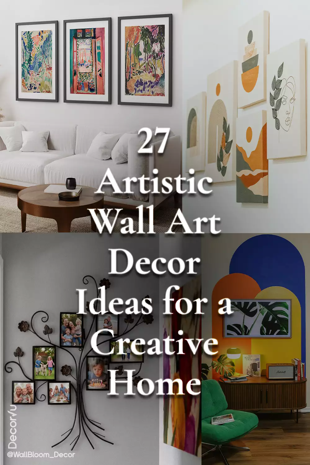
Three Framed Prints Bring Color to a Plain White Sofa
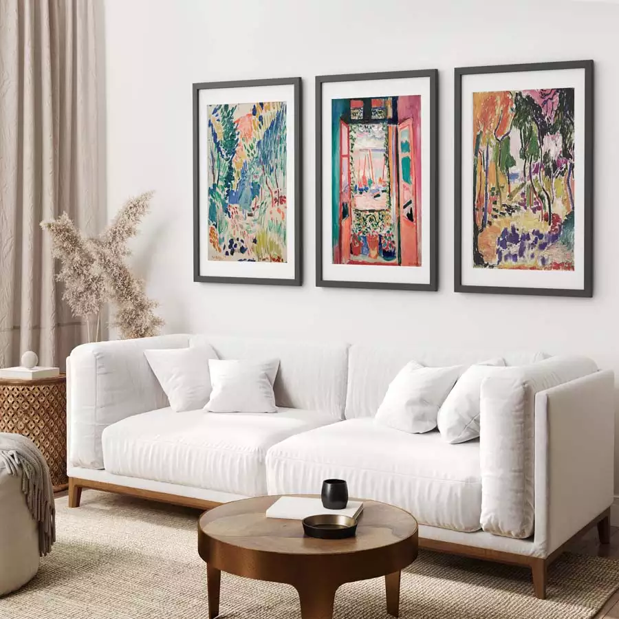
A white sectional sofa can swallow a room if nothing balances it, and three same-size black frames do the job here without crowding the wall. Each print pulls from a different palette—a swirl of greens and coral pinks in one, a warm orange-toned tree scene in another, and a bright open window overlooking a red-and-blue harbor in the third. The colors are loud on their own, but the matching frames and even spacing keep the whole thing looking deliberate rather than busy.
The prints read like the kind of cut-paper, garden-and-window scenes associated with Henri Matisse, and this exact set of framed reproductions is where they’re from. The code ALEXANDER10 takes 10% off if you decide to order it.
A Salon-Style Gallery Wall Layered With Woven Plates
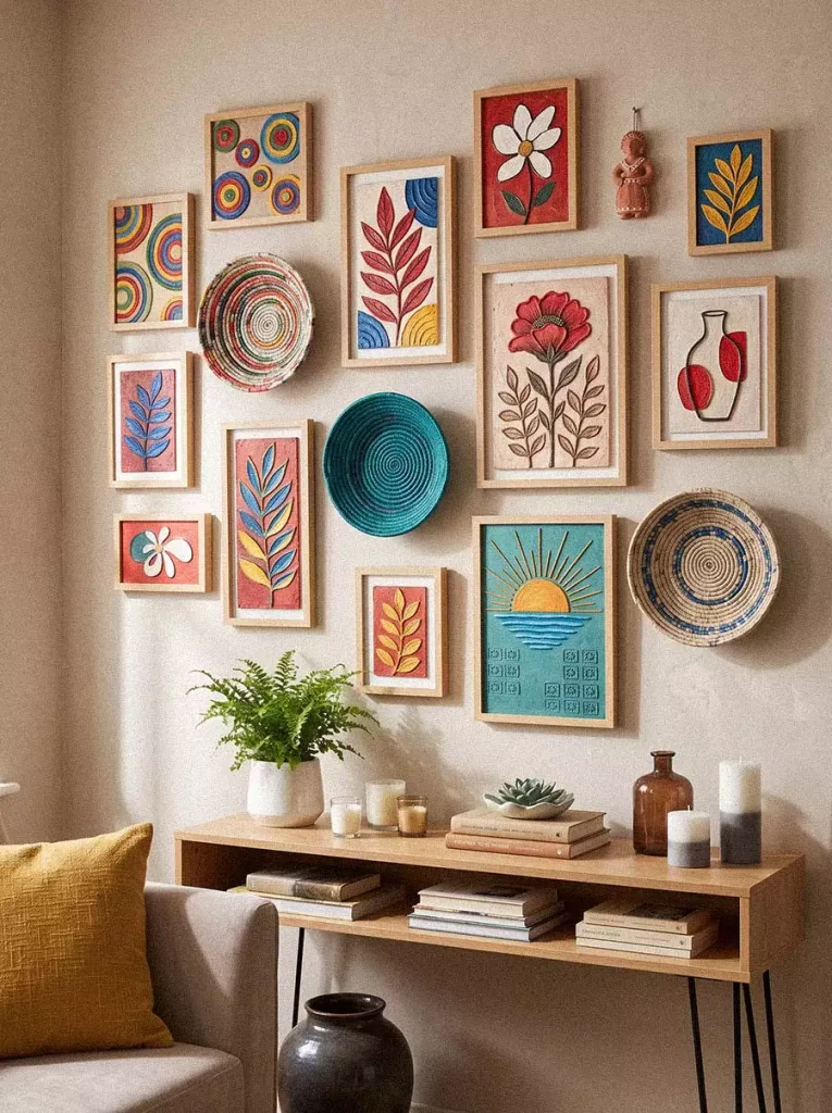
This one leans into density rather than restraint. Frame sizes and finishes vary from piece to piece, and woven rattan plates and a small carved figure are worked in between the framed prints, giving the arrangement texture that flat art alone wouldn’t have. Reds, blues, and mustard yellows repeat across the different pieces, which is likely what keeps such a mismatched layout from feeling chaotic.
It’s a good example of how much visual interest home decor can carry when nothing on the wall matches exactly, as long as the color story stays consistent. A console table underneath, with candles, a small plant, and stacked books, grounds the whole display.
Botanical Prints Set Above a Wainscoted Dining Wall

Three matching light-wood frames sit evenly spaced above a dining table, each holding a different botanical or landscape scene—layered leaves, a small sun over rolling hills, and a cluster of orange poppies. The wainscoting underneath adds a formal touch that a plain wall wouldn’t give.
The set pictured is close to this botanical canvas trio, which mixes floral and landscape imagery in a similarly muted, earthy palette. It’s an easy option for a dining nook that needs something above the table without a lot of visual weight.
A Monstera Print Framed Against Painted Arches
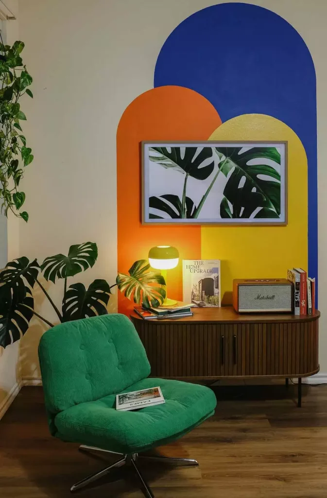
Instead of a plain wall, this print sits against a mural of layered painted arches in blue, orange, and yellow. The framed monstera leaf illustration is centered right where the orange and yellow shapes meet, and a real monstera plant sits just to the side, echoing the leaf shape in the print.
It’s a small detail, but pairing an illustrated plant with an actual one in the same shot ties the whole corner together in a way a plain frame on a white wall wouldn’t manage.
A Three-Panel Sunset Scene Over the Dining Table
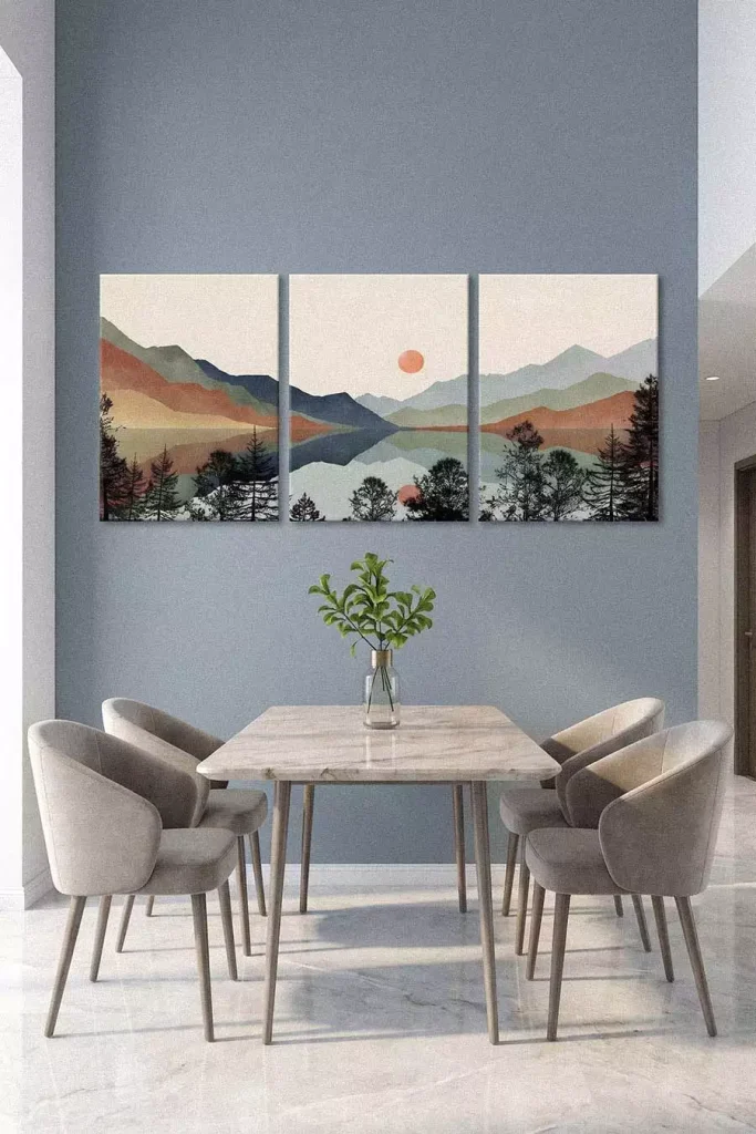
Split across three canvases, this landscape shows layered mountain silhouettes fading from warm orange in the foreground to cool blue-grey in the distance, with a soft sun reflected in a lake below. The panels span nearly the full width of the wall, which gives the dining table below a sense of scale it would otherwise lack against the muted blue-grey paint.
A similar three-panel mountain canvas set carries the same sunset-over-water composition, if this particular look is what you’re after for a dining room or living space.
Framed Photos Arranged Into a Giant Wall Clock
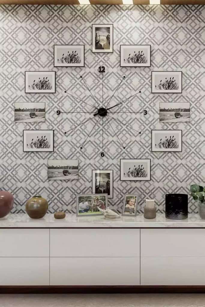
This is one of the more unusual displays in the set. A working clock mechanism sits at the center of a patterned wall, with its hands and hour markers radiating outward, and black-and-white framed photographs are positioned at each hour like the numbers on a clock face. It’s decorative and functional at once, which isn’t something most wall displays manage.
The geometric wallpaper behind it adds another layer of pattern, but the black frames and black clock hands keep the whole arrangement from feeling overloaded.
Vintage-Style Portraits in Mismatched Wooden Frames

Warm rust and orange backgrounds run through each of these stylized portrait paintings, all featuring women in a soft, illustrated style reminiscent of early twentieth-century fashion plates. The frames don’t match—some are pale wood, some dark, and one is plain black—but the consistent color palette across the paintings holds the grouping together.
They’re hung close together near a small round table, which makes the corner feel more like a curated collection than a random assortment of pieces.
A Four-Panel Geometric Canvas Set in Earthy Tones

Four canvases, each the same size, repeat a set of shapes across the group—arches, circles, and thin vertical lines—in terracotta, olive, and mustard. Black leaf silhouettes appear in every panel, which is the thread that ties the four pieces into one cohesive set rather than four separate paintings.
Arranged as a grid, it’s a straightforward example of wall decoration ideas that don’t rely on framing at all—the canvases are simply mounted edge to edge, letting the repeated motifs do the work instead.
A Maximalist Gallery Wall in a Colorful Bedroom
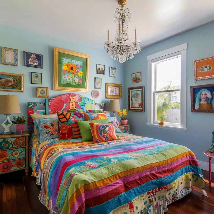
Almost every inch of this pale blue wall is covered—an ornate gold-framed floral painting, smaller folk-art pieces, a woven basket, and a portrait in an antique frame. A crystal chandelier hangs overhead, and the bed below is dressed in a striped, multicolored quilt that echoes the wall’s variety.
Nothing here matches, and that’s clearly intentional. The frames stay reasonably close together and roughly evenly spaced, which is what keeps a wall this packed from tipping into visual clutter.
A Bold Black and White Statement Piece Above the Bed
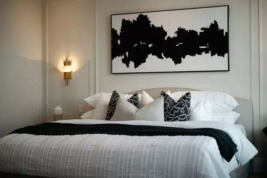
One wide horizontal canvas, framed simply in black, hangs centered above the bed. The image itself is abstract—a jagged black shape against white that could read as a skyline or ink blot depending on how you look at it. There’s nothing else on the wall, which is really the point.
Against the white bedding and a mix of patterned black-and-white throw pillows, the single piece carries the whole wall. It’s a useful reference for master bedroom decor when the goal is one statement rather than a full gallery arrangement.
A Grid of Sun and Bird Prints Over a Grey Console
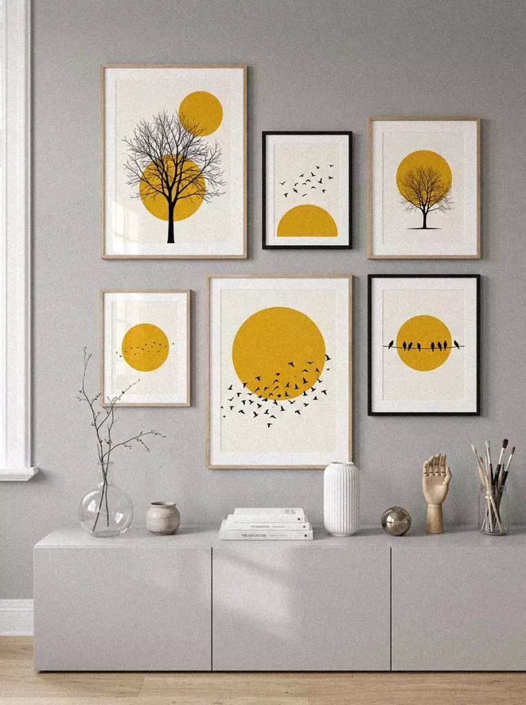
Seven prints, all built around a repeated mustard-yellow sun motif, are arranged in a loose grid over a low grey console. Some panels show birds in flight, others a bare tree, and one just a flock silhouetted against the sun. The frames mix light wood and black, but the recurring yellow color keeps the seven pieces reading as a set.
It’s a good illustration of how living room decor ideas can hold together visually even when the individual frames don’t match—repetition in color or motif does more work than matching frames ever could.
Books, a ceramic vase, and a small wooden hand sculpture on the console below add texture without competing with the wall above.
Oversized Classical Engravings in a Symmetrical Grid

Four large black-framed prints, each showing a circular classical engraving of cherubs and pastoral scenes, are arranged in a tight two-by-two grid above the bed. Crystal wall sconces flank either side, and a black-and-white checkerboard floor runs below—the whole room leans formal rather than casual.
The symmetry here is doing most of the work. Four identical frame sizes, perfectly aligned, give the wall a gallery feel that a looser arrangement wouldn’t achieve in this particular setting.
Line Art and Shapes Layered at Different Angles
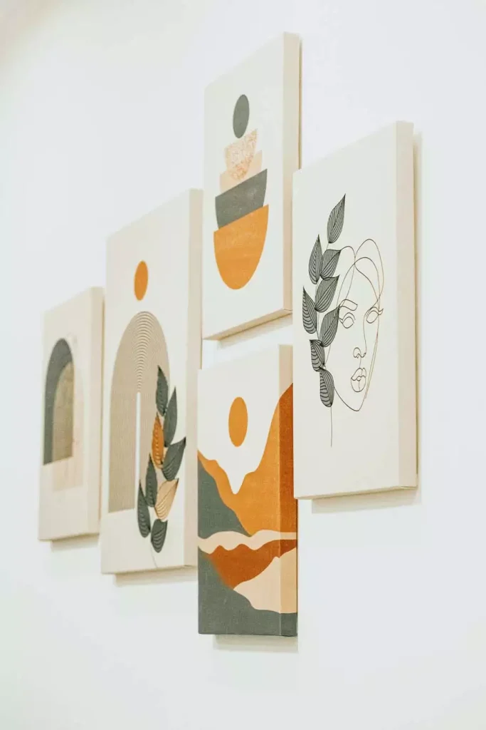
Rather than hanging flush against the wall, these canvases are mounted at slightly different depths, giving the whole cluster a layered, almost sculptural quality. A single-line face drawing sits beside abstract mountain shapes and a half-circle arch motif, all in muted cream, grey, and burnt orange.
It’s a subtler way to add dimension to a wall without resorting to heavier three-dimensional pieces—just a bit of physical depth between one canvas and the next.
A Trailing Plant Tucked Into a Black Picture Frame
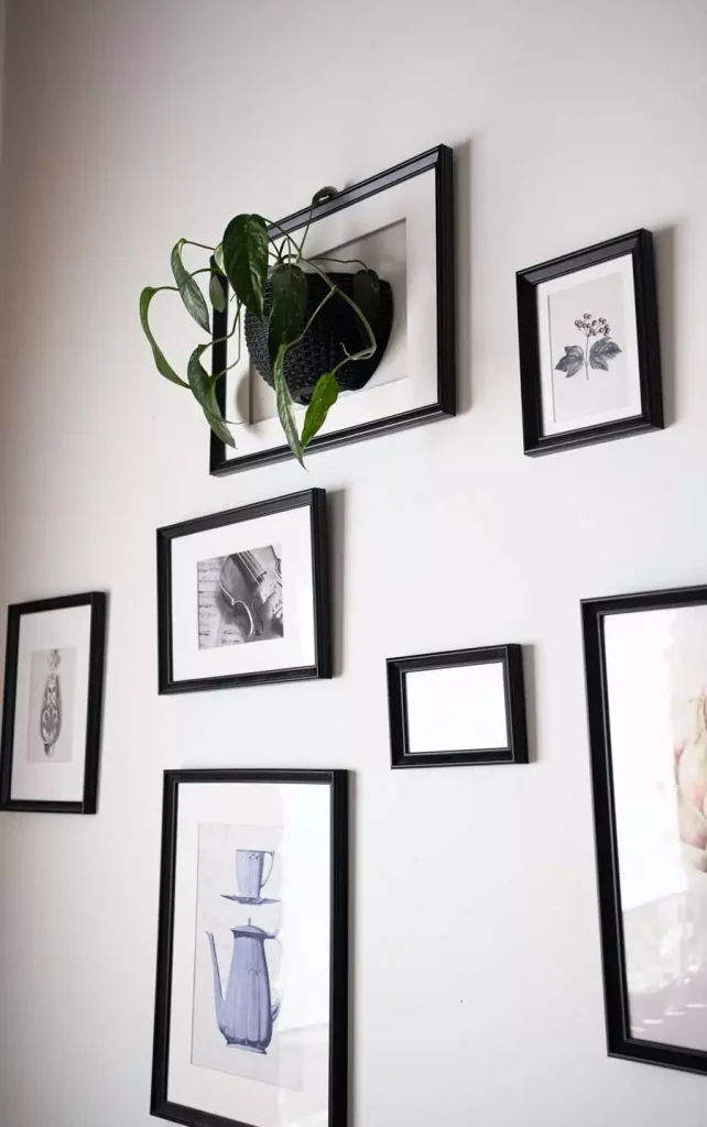
One frame here holds no art at all. Instead, a small hanging planter with a trailing pothos sits inside a black frame, its vines spilling out over the edges. Around it, smaller black-framed sketches—a violin, a vase, a teapot—keep the black-frame theme consistent even though the subjects don’t relate to each other.
It’s a small trick for adding texture to otherwise plain room decor without buying more art. Repurposing one frame as a planter changes the rhythm of the wall just enough.
Matching Nature Silhouettes in Shield-Shaped Frames

Two identically shaped prints—hexagonal, almost shield-like—sit side by side above a small wood console. One shows a deer silhouetted against a warm orange sunset, the other a fox in a cooler blue-green forest scene. Same shape, same composition, opposite color temperatures.
A floor lamp stands just beside them, and a small potted plant sits on the console below, but the pair of prints is really what carries the corner.
Small Abstract Squares Tucked Into a Plant-Filled Corner

A row of small, brightly colored square paintings hangs above a reading corner that’s dense with houseplants—a large monstera in front partially obscures the lowest pieces. A black gooseneck lamp curves down from the side.
The art here isn’t the focal point so much as background color peeking through the greenery, which is a different approach from most of the more formally arranged walls in this list.
Bold Figurative Portraits Beside a Wall Sconce
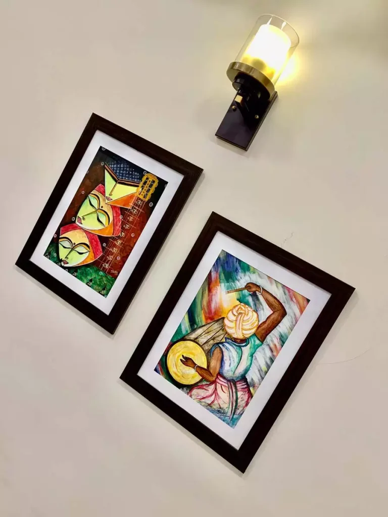
Two watercolor-style portraits, angular and vividly colored, hang in dark wood frames that don’t quite match each other. A brass-and-glass wall sconce sits just above and between them, its warm light picking up the yellows and reds in the paintings.
The figures themselves are stylized rather than realistic, closer to folk art than portraiture, which gives the pairing a lot more personality than a typical matched print set.
A Metal Tree Sculpture That Doubles as a Photo Display
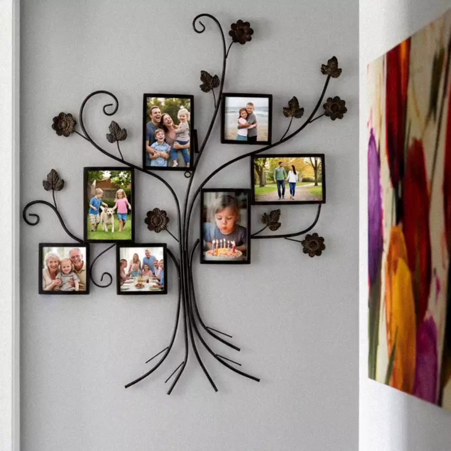
Rather than framed prints, this piece is a wrought-metal tree mounted directly on the wall, its branches ending in small square photo frames and its roots trailing down toward the floor. Family photos fill each frame—kids, grandparents, a birthday cake—turning the sculpture into a functional family tree rather than a decorative object alone.
It’s a wall decoration idea that puts the photos front and center instead of treating them as an afterthought scattered among other art. A colorful abstract canvas is just visible at the edge of the frame, suggesting it sits within a larger gallery arrangement.
A Moody Floral Still Life Above a Vintage Dresser

Dark, almost black backgrounds are common in traditional still-life painting, and this framed print follows that convention—pale roses and dark red blooms emerging from shadow, set in an ornate gold frame. It hangs above a vintage wood secretary desk, flanked by sheer curtains that let in soft light.
Small brass candlesticks and a potted plant on the desk surface below pick up just enough warmth to keep the dark painting from making the whole corner feel heavy.
Twin Illustrated Portraits Under a Pendant Light
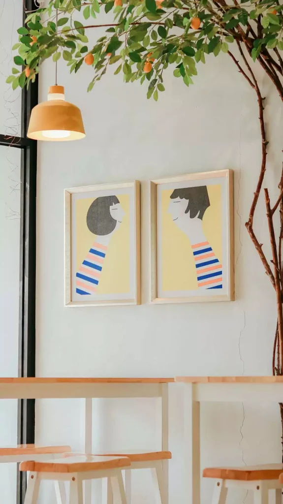
Two matching light-wood frames hold illustrations of stylized figures against a mustard-yellow background, both wearing the same striped shirt in blue and coral. Hung side by side at the same height, they read almost like a diptych rather than two separate pieces.
A mustard pendant lamp hangs just above, and the light wood stools and tables beneath continue the same warm, casual palette.
A Long Horizontal Landscape Above a Tufted Headboard
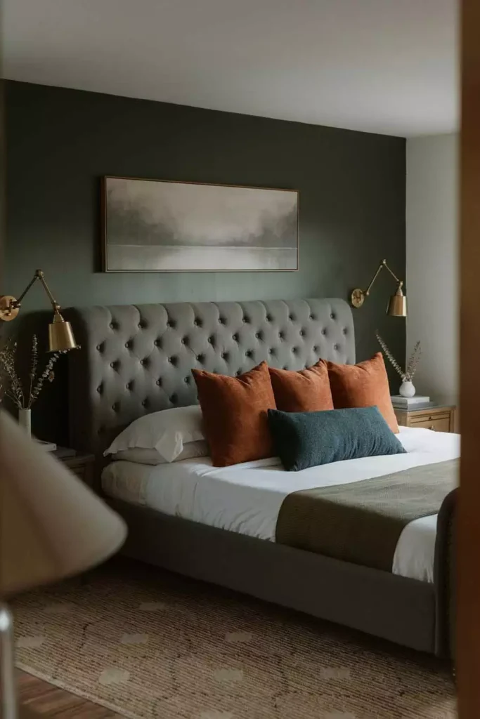
A muted, wide landscape—soft trees and hills in olive and grey tones—spans most of the width of a tufted grey headboard. Brass swing-arm sconces sit on either side, mounted directly to the wall rather than resting on nightstands, which keeps the surfaces below clear.
Rust and navy pillows on the bed pull color from the painting without matching it exactly, which is a subtler way to connect the two than choosing bedding in the same palette.
A Music-Themed Typography Wall on Exposed Brick
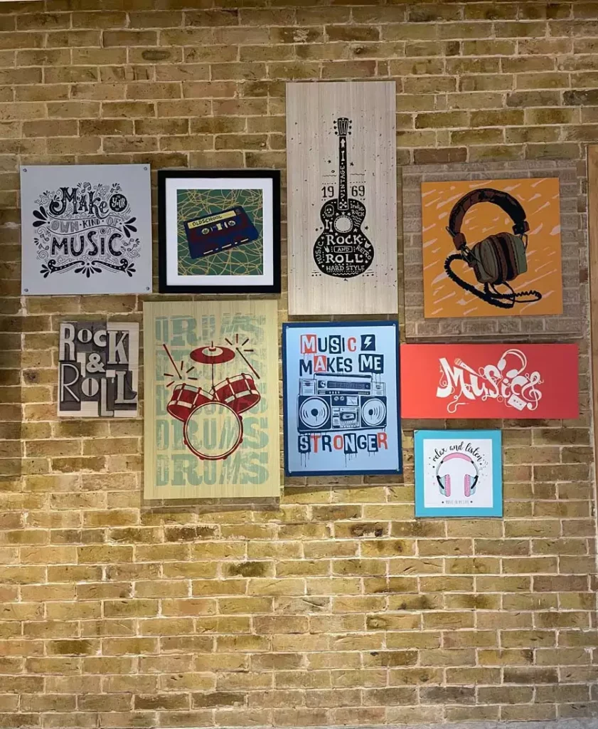
Exposed brick makes an unconventional backdrop, but it suits this collection of music-themed prints—a guitar silhouette, a cassette tape, a drum kit graphic, and several typography pieces spelling out phrases about music and rhythm. Frame styles vary widely, and some pieces aren’t framed at all, just mounted flat against the brick.
The mismatched sizes and styles work here because the theme is so consistent. It reads more like a collection built over time than a set purchased all at once.
An Eclectic Gallery Wall Behind a Deep Blue Sofa
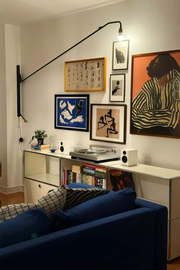
This wall mixes a surprising range of styles—a framed calligraphy scroll, a cut-paper bird illustration in bold blue, a figurative charcoal sketch, and a large orange-toned portrait canvas that anchors the whole group. A swing-arm lamp extends out from the wall above, and a turntable sits on the cabinet below.
Nothing about the pairing is obvious on paper, but the warm wood tones in several of the frames and the recurring dark backgrounds keep it from feeling random.
A Working Moodboard Instead of a Traditional Gallery Wall
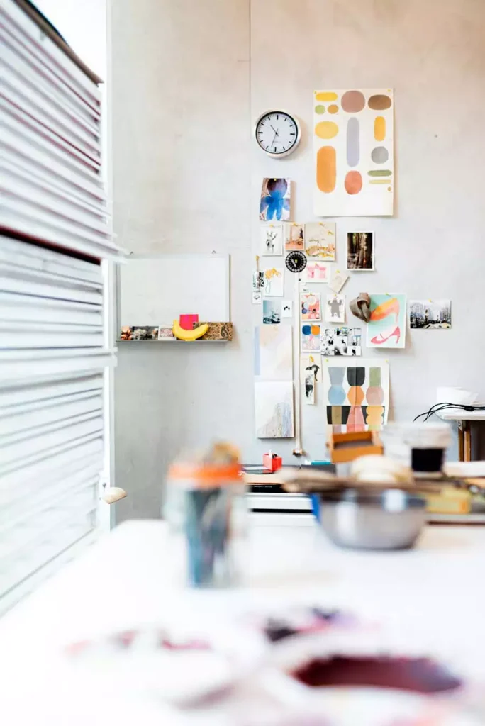
Not every wall here is a finished display. This one is closer to a working reference board—postcards, sketches, a color-block print, and a small round wall clock, all pinned up rather than framed. It’s the kind of wall that changes regularly rather than staying fixed.
For a creative space, there’s something to be said for this looser approach. It doesn’t need to be permanent to still function as wall decor.
A Dense Salon Wall of Impressionist-Style Garden Scenes
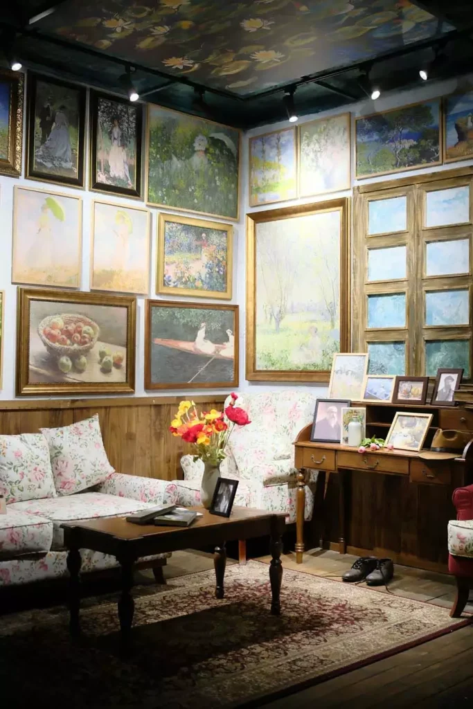
Nearly every inch of wall space here is covered in garden and floral paintings, framed in a mix of ornate gold and simple dark wood. The style throughout leans impressionist—soft brushwork, dappled light, women in gardens—and even the ceiling continues the theme with a painted floral mural.
A floral-upholstered sofa and a worn Persian rug complete the room, making the whole space feel like a single, fully committed vintage vignette rather than a wall treated separately from the furniture around it.
A Pastel Poster Wall Beside a Tall Houseplant
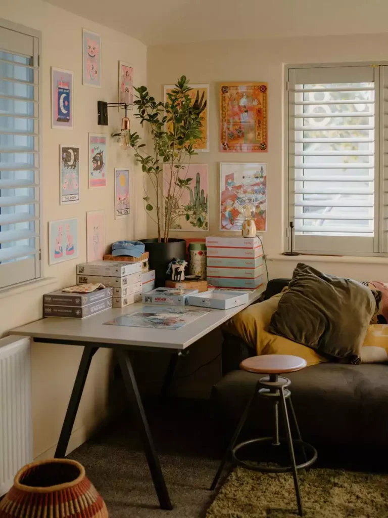
Small pastel-toned illustrated prints are spaced evenly across a cream wall, their subjects ranging from moon and sun motifs to playful character illustrations. A tall potted plant stands just beside the display, with a wall-mounted lamp extending over a small desk below.
The pale, consistent color palette across all the prints is what makes such a varied mix of subjects hang together as one collection instead of feeling scattered.
A Warm, Layered Corner With a Painted Portrait and Bold Pillows

A large portrait painting on wood, rendered in warm reds and golds, dominates this corner, with smaller framed prints and a hanging fabric banner layered around it. A shelf above holds plants and small objects, adding another layer above the art itself.
Below, a couch piled with mustard, olive, and patterned pillows picks up the warm tones from the portrait, tying the whole corner—wall and seating both—into one palette.
Take What Fits and Leave the Rest
Twenty-seven walls, and no two solve the problem the same way. Some lean into density and mismatched frames, others go quiet with a single statement piece, and a few skip frames entirely. If nothing else, that range is a reminder that there isn’t one right way to fill a wall.
Save whichever of these fits the room you’re actually working with, and treat the rest as options for later.