
A large wall gives you more freedom than a small one, but it also exposes weak choices fast. One tiny frame can disappear completely, while too many unrelated pieces can make the whole surface feel scattered.
These large wall decor ideas show much better ways to use that extra space. Some go all in with murals, sculptural reliefs, living greenery, or floor-to-ceiling paneling. Others build scale through repetition—rows of mirrors, botanical galleries, woven baskets, or coordinated art. The goal is not to fill every inch. It is to give the wall something with enough confidence to belong there.
A Collected Gallery That Spreads With the Furniture

The gallery above this low console works because it does not stop at one narrow stack of frames. Landscapes, sketches, and a small round mirror spread outward, while the blue patterned armchairs widen the composition even more.
Wood, black, and gold frames keep the arrangement relaxed rather than overly matched. The tall branches in front break through the grid of rectangles and stop the whole wall from feeling too flat.
One Giant Clock With Nothing to Prove

An oversized black-and-white clock takes up enough visual space that the wall does not need a gallery around it.
The simple wood console below keeps the arrangement grounded, and the small objects on top stay deliberately quiet. It is a good reminder that a large wall does not automatically need lots of decor—sometimes it just needs one piece with the right scale.
Pop Art Turned Into the Whole Backdrop
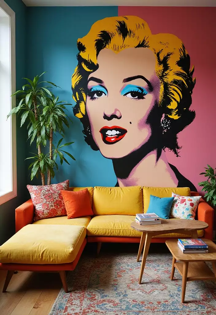
Subtle was clearly not invited to this room.
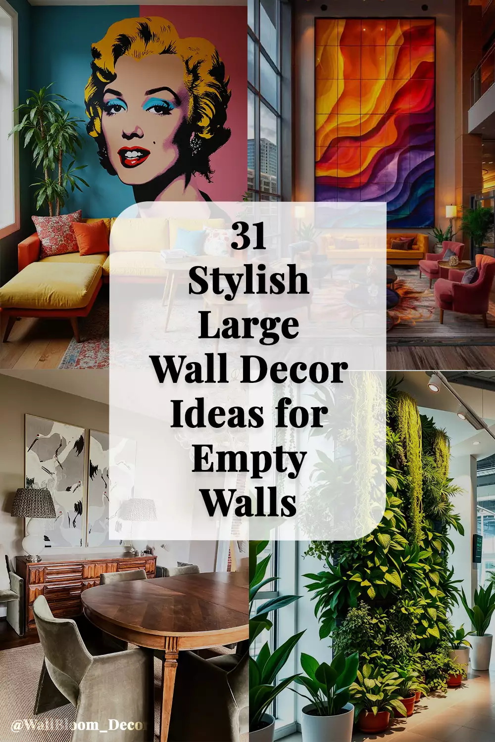
The colorful portrait mural stretches across a teal-and-pink wall behind a mustard-yellow sofa, so the art feels built into the room instead of added afterward. Red, orange, and patterned cushions pick up the mural’s energy lower down, while plants soften some of the harder graphic edges.
It is loud, playful, and exactly the right amount of unapologetic.
Reclaimed Wood With Real Depth
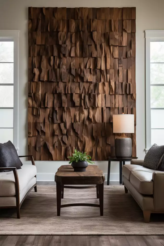
A huge mosaic of chunky wood blocks turns the space between two windows into something much more sculptural than a flat artwork.
The uneven faces catch daylight differently, revealing grain, shadow, and changing depth across the installation. With linen, leather, and warm neutrals around it, there is no need to add much color—the material itself gives the wall enough personality.
Tall Crane Art for a More Polished Dining Wall
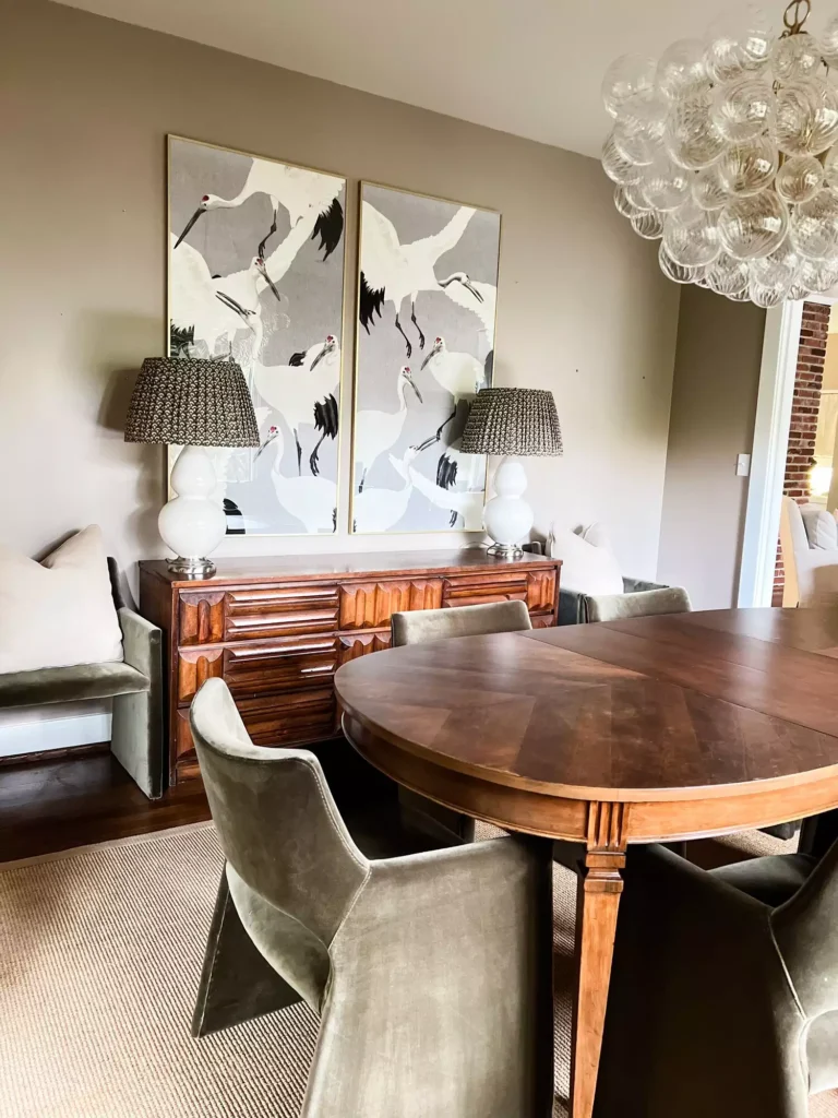
Two narrow crane panels give this dining room height without resorting to one enormous canvas.
Their vertical shape suits the taller wall, while the sideboard and matching lamps create a calm base underneath. The symmetry feels formal, but the birds keep the composition from becoming stiff.
A Mirror Grid That Makes Repetition Feel Big
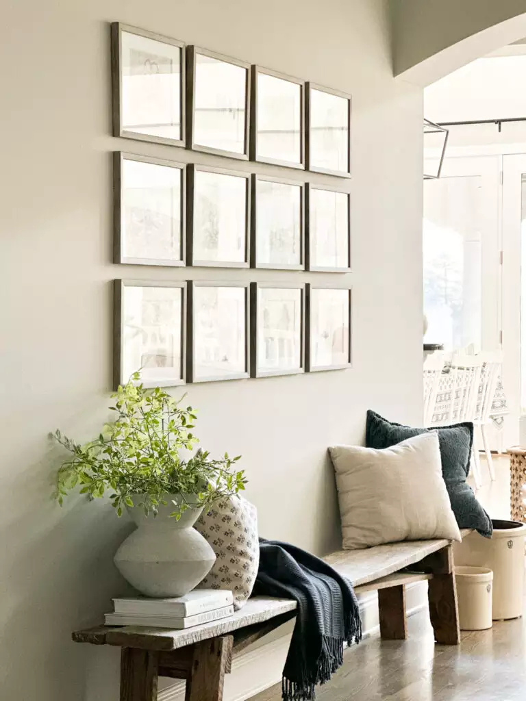
Twelve mirrors arranged in a neat grid turn many small pieces into one large statement.
That repetition is what makes the idea work. Each mirror is modest on its own, but together they cover enough wall to balance the rustic bench underneath. Light wood frames keep the whole grid airy while the reflections bring movement into an otherwise simple surface.
Indigo Textile Art With a Softer Edge
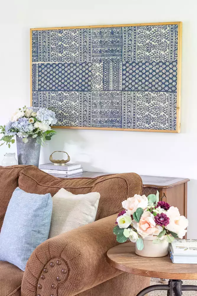
A large blue-and-cream patterned textile brings scale without giving the wall the harder feel of a giant framed print.
Its pattern does most of the decorating, while the simple wood frame gives it just enough structure. The blue cushion below quietly repeats the color, which makes the textile feel connected to the seating area rather than floating above it.
Woven Baskets With an Easy, Uneven Rhythm

Nothing here is lined up perfectly, and that is part of the charm.
Different basket sizes, weaves, and open patterns spread across the wall above the leather bench, creating enough variety to fill the space without needing strong color. Similar natural tones hold the whole collection together.
It feels like something gathered slowly rather than ordered as a set.
Basket Art With a Much Moodier Side

Move woven pieces onto a charcoal-paneled wall and they suddenly feel far more dramatic.
Natural, cream, black, and patterned baskets stand out sharply against the dark surface, almost like individual sculptures. A black chandelier continues that depth overhead, while cream dining chairs bring some brightness back into the lower half of the room.
Same material family, completely different mood.
When the Wall Is Actually Alive

This vertical garden skips traditional wall decor entirely.
Dense greenery, trailing vines, and different leaf shapes cover the surface from side to side, so the planting becomes part of the architecture. Plants at floor level blur the transition even further, making the whole feature feel grown into the room rather than mounted onto it.
A wall like this does not need anything framed in front of it.
Metallic Ribbons With Museum Energy

Curving metal bands sweep across this bright wall like a sculpture frozen in motion.
The piece gets much of its drama from shadow. As light moves across the surface, the overlapping curves create new dark and bright areas behind them.
A large open wall gives sculptural art like this room to breathe, which is exactly why it feels so much stronger here than it would squeezed between other decor.
Fifteen Botanicals, All Beautifully Behaved
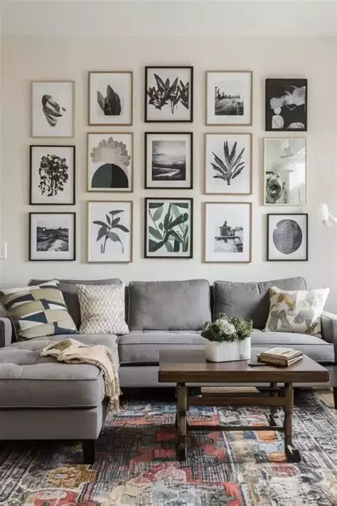
This gallery wall is busy in quantity but calm in organization.
Botanical drawings, photography, and nature-inspired pieces sit in three orderly rows above the gray sectional. The strict spacing gives all those different images a shared structure, while the vintage-style rug below keeps the room from feeling too formal.
It is the neat side of gallery-wall decorating.
Let the Fireplace Do Most of the Talking

There is already a lot happening before artwork even enters the picture.
The tall stone fireplace climbs through the double-height room, while a carved wood panel adds a second texture nearby. Built-in shelving fills the remaining wall space without competing with either feature.
In a room like this, the smartest large-wall decision can be knowing the architecture already has enough presence.
A Giant Starburst With an Industrial Twist

Wooden slats radiate from a central point, joined by visible metal brackets and hardware.
From across the room it reads as one bold geometric symbol. Up close, the raw materials and construction details become part of the appeal.
The design is simple in principle, but expanding it to this scale is what turns it from wall art into something almost architectural.
A Moonlit Mural You Can Get Lost In

A glowing moon hangs over mountains, water, trees, and mist across this floor-to-ceiling landscape.
The mural does more than decorate the wall—it changes the atmosphere around the seating area. Curved pale chairs stay quiet in front of it, allowing the scenery to create the mood.
This is one of those cases where the wall becomes the experience.
Warm Color Sweeping Through a Double-Height Room
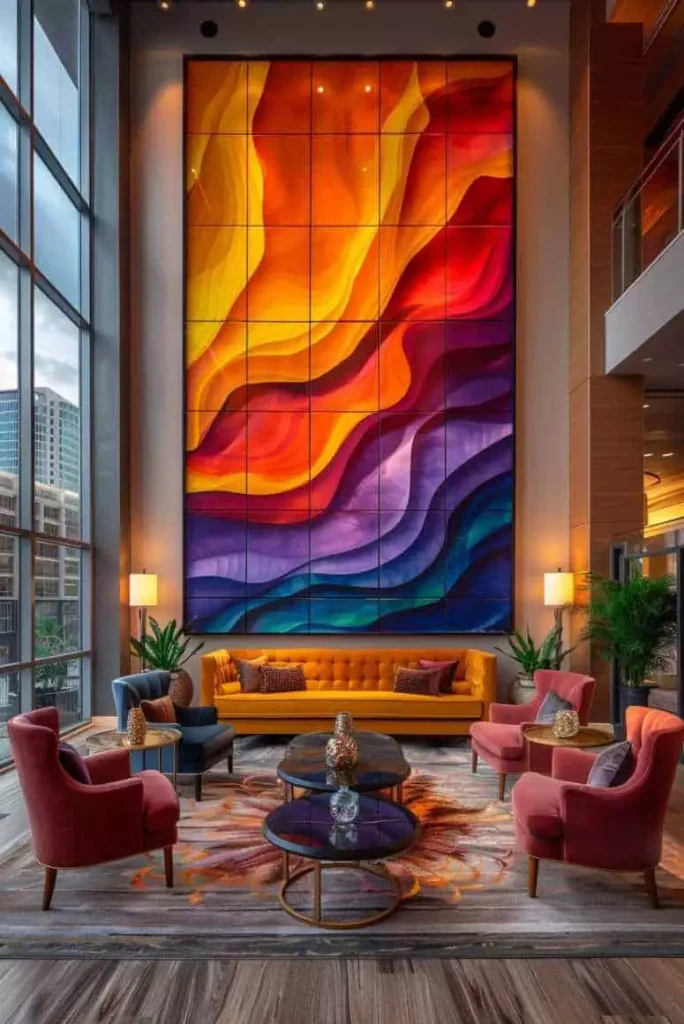
Yellow, orange, red, and purple move across this tall abstract panel in one continuous flow.
Its height makes sense of the huge wall, while the mustard sofa and jewel-toned chairs below pull pieces of that palette into the room. Without those smaller color echoes, the artwork could feel disconnected; with them, it becomes the anchor.
A Glowing Wall Shaped Like Desert Dunes
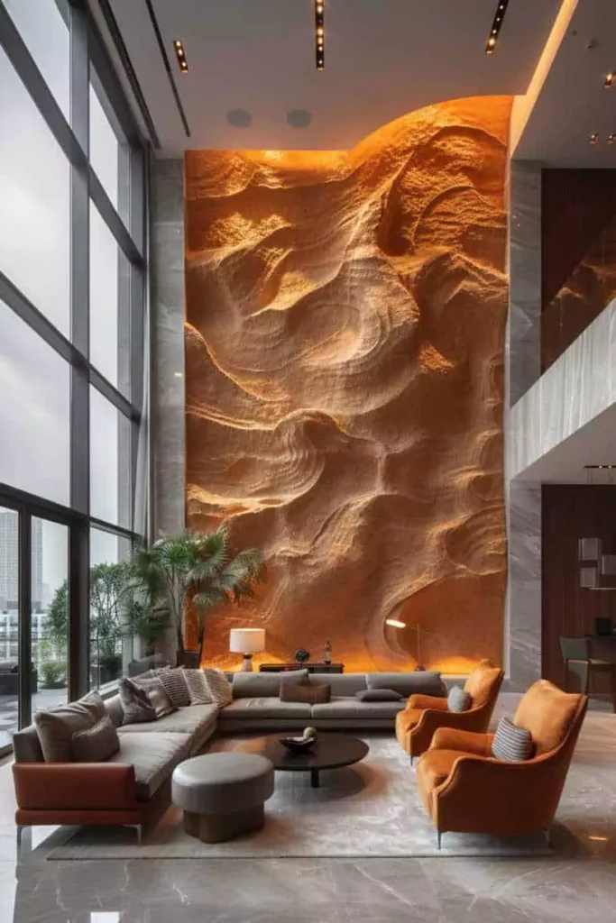
Deep carved ridges make this orange feature panel look almost windswept.
Warm light from below exaggerates every rise and dip, turning the texture into something far more dramatic after dark. Soft gray furniture sits quietly in front, giving the amber wall even more intensity.
No extra artwork needed—the shadows are doing enough.
Abstract Art With Fringe That Keeps Going
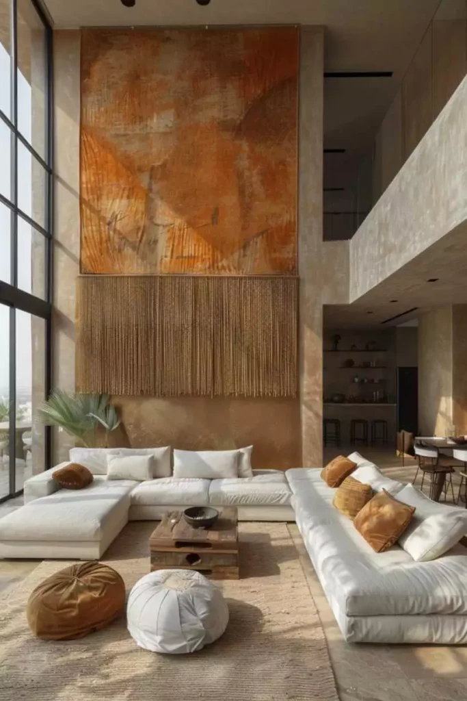
This rust-and-beige panel refuses to stop at the bottom of the frame.
Long woven fringe drops underneath, extending the artwork farther down the wall and adding movement to an otherwise flat composition. The earthy palette blends naturally with the pale plaster, jute rug, and neutral sectional around it.
It is a nice reminder that large wall art does not have to stay rigidly rectangular.
A Tree Slice Big Enough to Become the Main Event

A massive wood slab dominates the space above the stone fireplace, complete with visible rings, splits, and an irregular natural edge.
Smaller wood pieces nearby repeat the same organic language, but the central slab is clearly in charge. Warm lighting along the mantel brings the grain forward at night and makes the whole fireplace area feel even richer.
Rustic decor rarely needs much help when the raw material is this dramatic.
One Enormous Flower, Surprisingly Quiet

The scale is huge, yet the pale palette keeps this sculptural flower from feeling loud.
Layered white petals create deep shadows, and the warm center gives the eye somewhere to land. Because the furniture and walls stay creamy and restrained, the flower can take up a lot of space without visually crowding the room.
Big does not always have to mean bright.
A Lotus Relief That Glows From Within
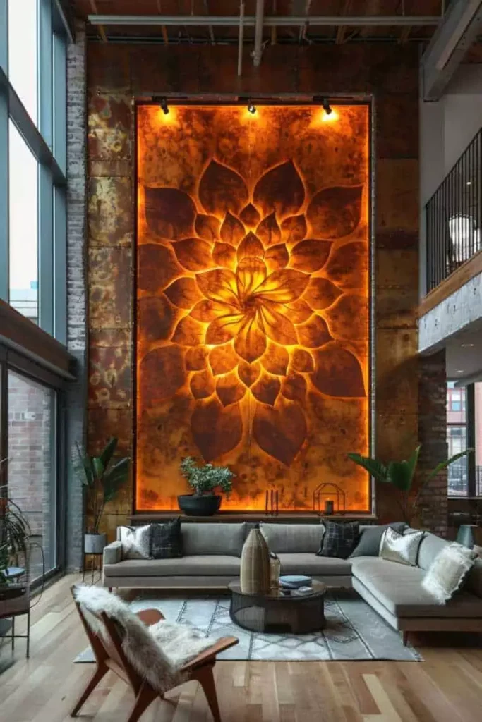
Warm amber lighting completely changes this carved lotus wall.
The petals radiate outward in a symmetrical pattern, but the hidden glow gives each ridge extra depth and makes the piece feel almost illuminated from inside. Exposed brick and darker structural details nearby bring a rougher contrast that keeps the floral shape from becoming too delicate.
A Gallery Wall for Someone Who Actually Collects Things
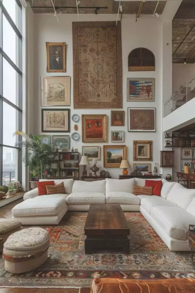
Paintings, portraits, plates, small frames, and a large hanging textile all share this wall—and somehow nobody is fighting.
The textile creates a strong central anchor, while smaller pieces spread outward in different frame styles and sizes. There is no attempt to make everything match, which is exactly why it feels believable.
The long white sofa underneath gives the entire busy collection a calm base.
Plaster Texture Doing Half the Decorating
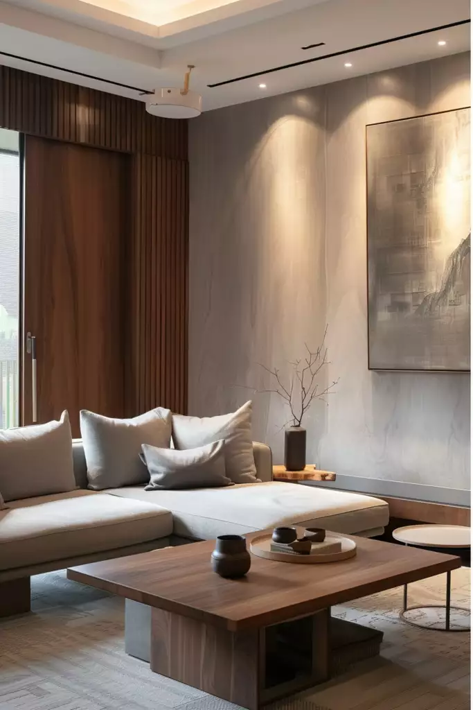
One large abstract artwork sits against a softly textured plaster wall, and that restraint works beautifully here.
The wall already has subtle variation, so covering it with more objects would hide part of its appeal. Warm wood paneling and recessed lighting add depth around the edges instead.
Sometimes the expensive-looking move is leaving some of the wall visible.
Metallic Pebbles Floating Over the Sofa
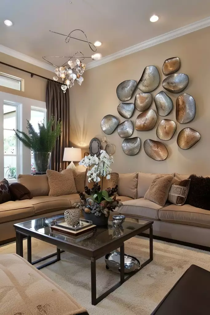
Silver and bronze forms scatter across the wall in an loose, organic cluster.
Their rounded shapes keep the arrangement softer than a grid, while hammered-looking surfaces catch light differently from piece to piece. Even the bubble-like chandelier overhead echoes those curves, helping the wall art feel connected to the room.
Six Metallic Reliefs With Very Satisfying Order

This wall goes in the opposite direction: everything is precise.
Six matching frames form an even grid above the sectional, each holding a different shell- or coral-inspired relief. The subjects vary just enough to create interest, while identical sizing and spacing keep the overall look polished.
Paneling behind the set adds another quiet layer without breaking the symmetry.
White Waves Colliding With Warm Wood

This feature wall gets its impact from putting two completely different textures side by side.
Soft white ridges move across one section, while concentric wood rings create a warmer focal point beside them. The live-edge table below repeats the wood without copying the wall.
It feels custom because the surfaces were designed as part of one composition rather than treated as separate decorations.
A White Relief That Looks Frozen Mid-Fold

The sculpture almost resembles fabric caught in motion.
Raised folds create shadow after shadow across the pale surface, which is why the piece can stay completely monochrome and still hold such a large wall. A simple molding frame makes it feel integrated into the architecture instead of merely hung there.
The beige sofa below wisely stays out of the competition.
Traditional Furniture, Modern Art, No Problem
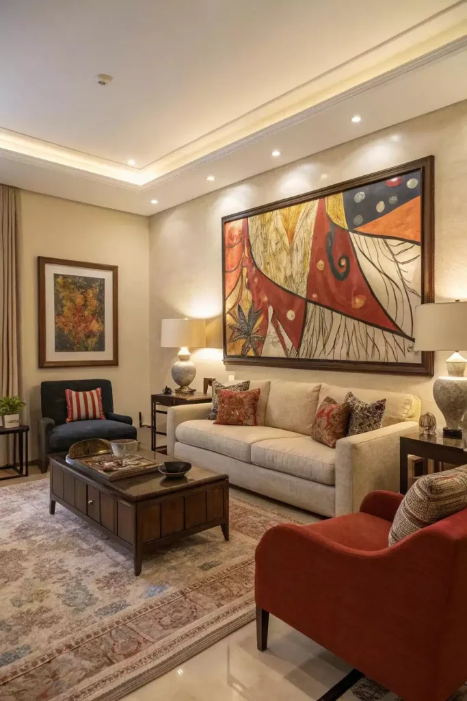
A classic beige sofa sits beneath a large abstract painting filled with red, mustard, navy, and cream.
That contrast gives the room much more personality than matching traditional artwork would. Patterned cushions repeat a few of the painting’s warmer colors, quietly bridging the gap between old-school furniture and modern art.
Different styles can get along surprisingly well when color introduces them.
A Hallway That Became a Botanical Collection

Dozens of plant studies, illustrations, and floral prints transform this narrow passage into a wall you actually want to stop and inspect.
The frames range from slim gold to darker and chunkier wood, which keeps the collection from becoming a repetitive grid. A small lamp and table at the end add warmth and make the hallway feel more like part of the home rather than a route between rooms.
This is the kind of gallery that gets better as it grows.
White Paneling Making Art Completely Optional
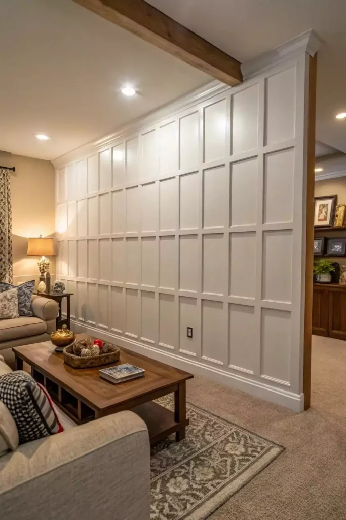
There is not a single framed piece on this wall, and it does not feel empty for a second.
Square paneling runs from floor to ceiling, using repetition and shadow to create architectural interest across the entire surface. A rustic wood beam above introduces enough warmth to keep the crisp white grid from feeling sterile.
Sometimes the best wall decor is built into the wall.
Florals, Botanicals, and Woven Pieces All Sharing One Wall

A large dimensional flower takes the center position here, surrounded by botanical prints, leaf imagery, woven circles, and smaller decorative pieces.
There is plenty of variety, but warm gold-toned frames give the composition a visual thread. Mixing flat artwork with raised textures also keeps such a wide gallery from looking like one continuous layer of rectangles.
It is busy, but it knows where its center is.
A Big Wall Does Not Need a Big Pile of Decor
Some of these walls are packed with dozens of pieces. Others have one clock, one mural, one carved panel, or no hanging artwork at all.
That is what makes a large wall interesting to decorate: scale can come from completely different places. A grid gets there through repetition. A mural uses coverage. Sculptural pieces use depth and shadow. Paneling turns the surface itself into the feature.
The mistake is not leaving some wall visible. It is choosing something too timid for the space and hoping it will somehow grow once it is hung.